


Playbook Adoption
Fintech | B2B
How can a dashboard be designed to drive sales optimization, not just performance monitoring?
Why This Problem Was Worth Solving
Background
Winn.ai is an AI-Powered Real-Time Sales Assistant Platform. AI-powered real-time sales assistant joins virtual meeting and helps sales reps focus more on customers by reducing administrative tasks: detecting customer answers during calls, immediately surfaces information for salespeople and updates CRM systems, and Improves productivity by automating note-taking and follow-up actions. While competitors offered post-call summaries with 5-60 minute delays, Winn.ai's unique value proposition was real-time insights during live calls with instant CRM synchronization.
Where Teams Were Losing Time
PAIN POINTS
“As a VP Sales I want track sales teams performance so that I can identify top performers, spot bottlenecks early, and make data-driven decisions to hit revenue targets.”
“As a Sales ManagerI want to track my team's performance and optimize playbooks so that I can close skill gaps faster and consistently hit our quarterly quota.”
“As a SDR I want to reduced time-to-CRM and faster follow-up emails so that I can focus more time on actual selling instead of admin work, and never let a hot lead go cold.”
“As a Winn.ai VP Sales I want to reduce paperwork to almost zero, proof of competitive differentiation and Platform to showcase real-time capabilities so that prospects immediately understand why we are different from Gong and Chorus, and choose us over the competition.”
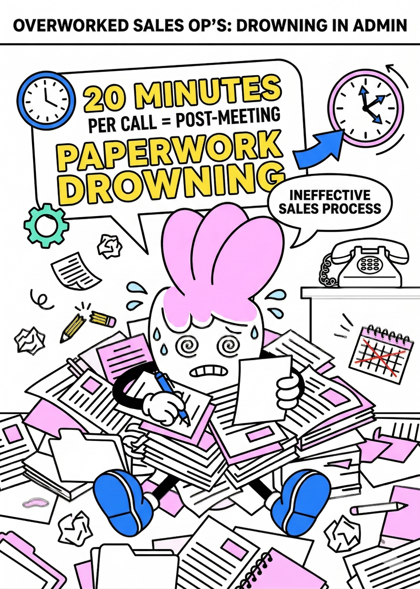
"Our reps were spending 20 minutes after every single call. That's almost half a meeting just gone."
Where Teams Were Losing Time
main goal
Winn.ai claimed we could reduce it to almost zero. And Winn.ai decided to prove this. Create dashboard that will help
Customers:
- To increased team performance through better playbook adoption
- To reduced time-to-CRM (targeting 0 minutes vs. 4.5-minute industry benchmark)
- To enable sales managers to track team performance and optimize playbooks
Company:
- To demonstrate ROI to existing customers and prove our competitive advantage with measurable data
- To retain customers through demonstrated value
- To platform to showcase real-time capabilities
The Impact in Numbers
RESULTS
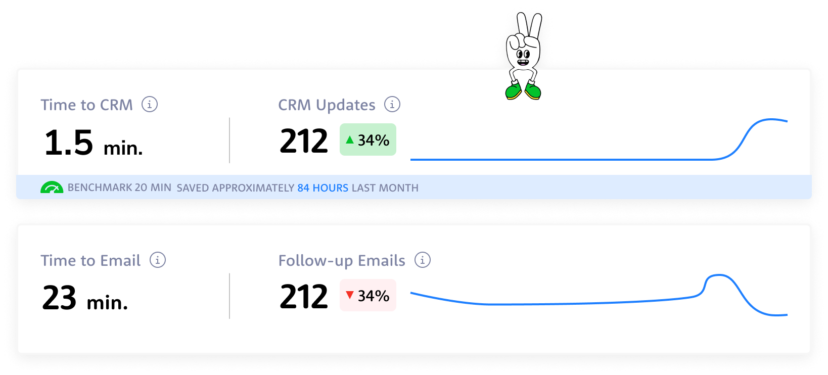
TIME TO CRM
20 min

1.5 min

Reps can reduce time spent on CRM admin by up to 85–98%.
FILL RATE
7%

63%
Customers reported 9x higher CRM fill rate.
PLAYBOOK ADOPTION
66%
82%
Live playbook coaching drives 2x higher improvement in playbook adoption.
Same interface, different perspective
OUTCOME
Rather than building different dashboards for VP Sales and Sales Team Leader, I found a way to satisfy everyone with one design: the "User vs. Team" Strategy: For VP Sales and Sales Managers, I created the same dashboard with one crucial difference - where Sales Managers saw "USERS" (individual rep data), the VP saw "TEAMS" (aggregated team data).
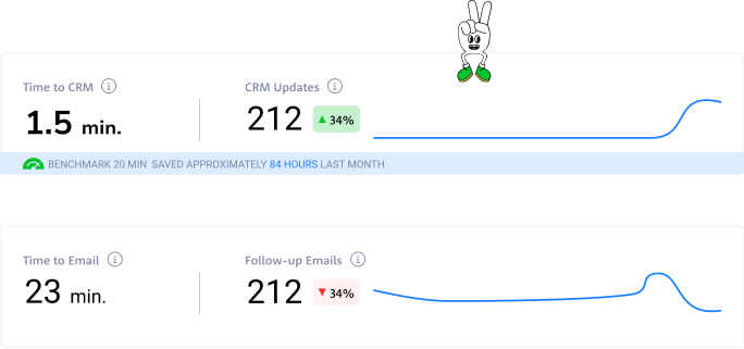
From drowning in post-meeting paperwork to reclaiming hours back in the day — these numbers tell the story of a team that stopped doing admin and started selling again.

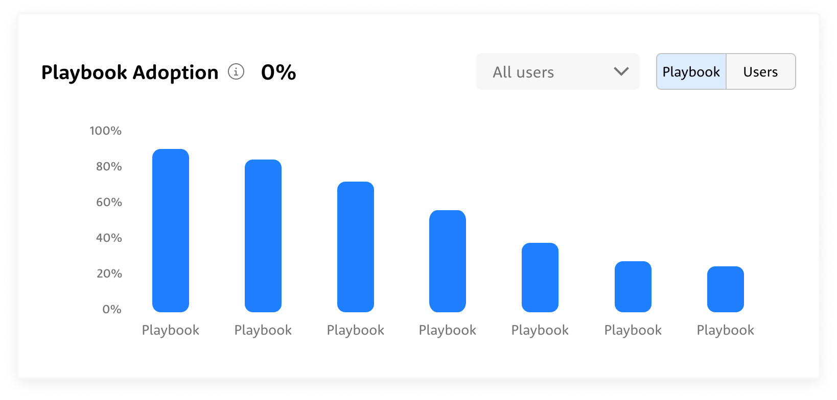
Not every playbook gets equal love — some are followed religiously, others barely touched. The chart exposes exactly where the gaps are, so managers can coach to reality, not assumption.
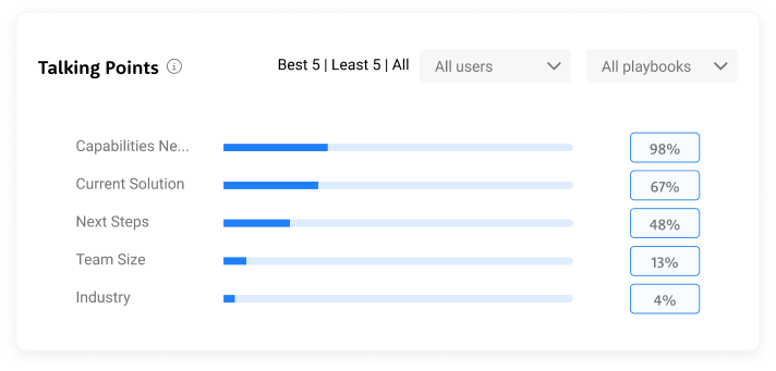
Some talking points land consistently, others get skipped almost every call — the data shows exactly where the conversation breaks down before it even gets started.
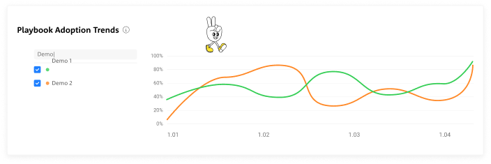
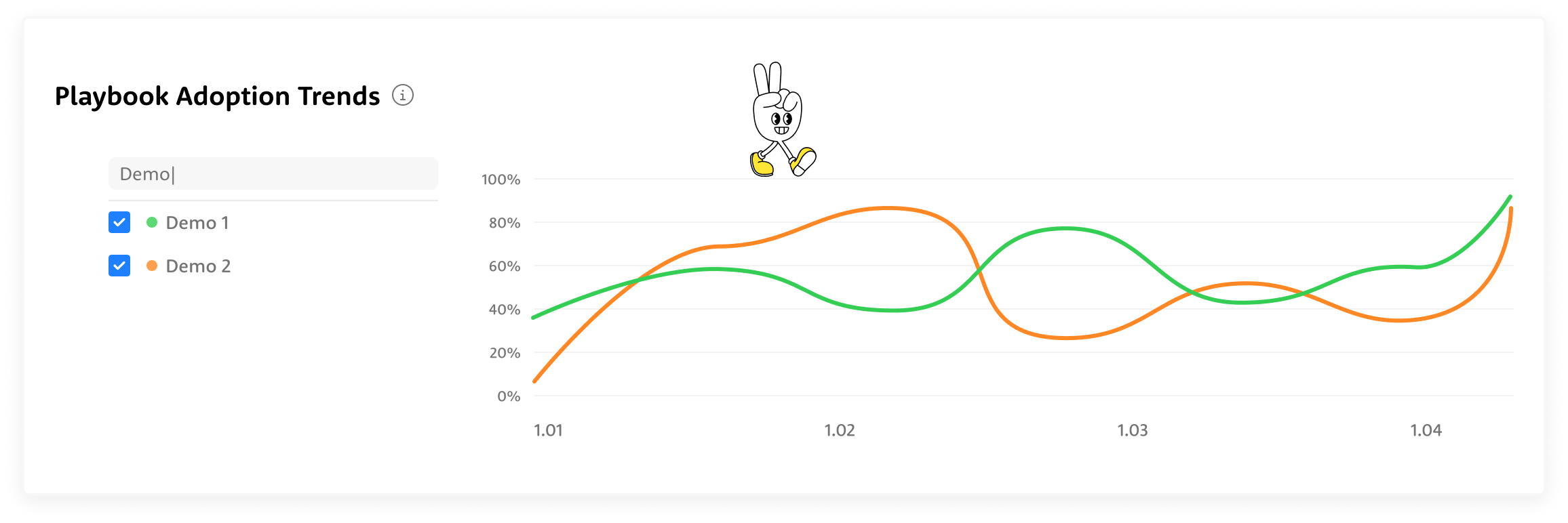
Adoption doesn't move in a straight line — it shifts, dips, and spikes over time, and the trends reveal which playbooks are gaining traction and which are quietly fading out.
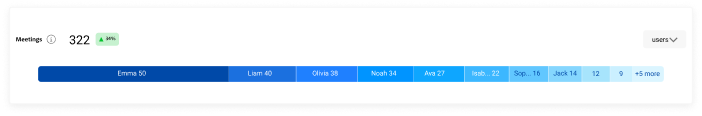
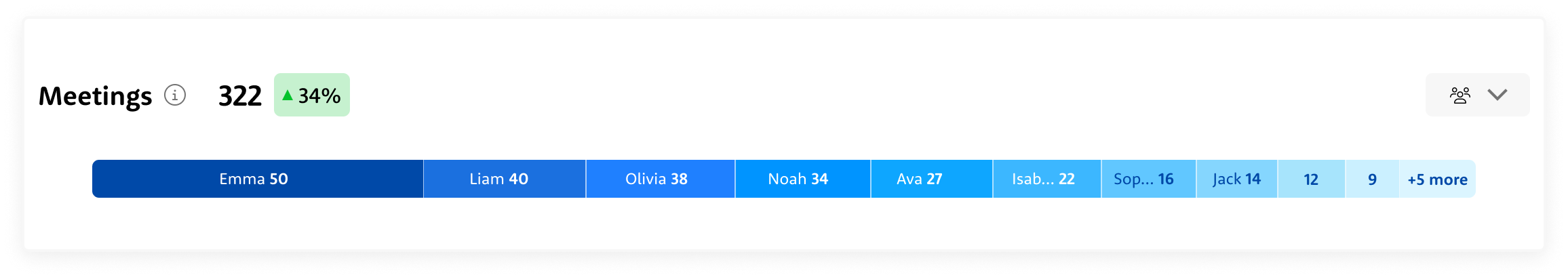
322 meetings, up 34% — and at a glance, you can see exactly who's carrying the weight and where the drop-off begins.
3-week deadline
The start
It was my first day in the company. The PM's preliminary research consisted of 6 key metrics.Each stakeholder required completely different things:
- VP Sales: high-level executive view
- Sales Reps: operational metrics
- Sales Managers: rep performance
I made a strategic call: create one concept that would be suitable for all layers with small changes. This meant designing a flexible foundation that could scale up for executives and drill down for operations, while prioritizing the daily users who would make or break adoption.
Approach & Constraints
Three iterations in three days. I conducted daily 20-minute conversations with our 3 internal sales managers and director who actively used the Winn.ai system. I focused on understanding how a dashboard would help them and mapping their real workflow after analyzing dashboard data. Since they were actual users of our system, their feedback was invaluable for understanding practical needs rather than theoretical requirements.
VP Sales
- Cross-team performance overview at a glance
- Quarterly trends to track progress against revenue targets
- Instant visibility into which teams are ahead and which need attention
- Data to back every strategic decision in leadership meetings
Sales Managers
- Daily rep-level performance to know exactly who needs coaching
- Talking points and playbook adoption per individual
- Actionable insights to run sharper 1-on-1s
- Real-time signals to catch deals at risk before it's too late
Sales Reps
- Personal performance dashboard to track your own progress
- Clear visibility into which talking points and playbooks are working
- Less time on admin, more time on actual selling
- Real-time guidance during calls so nothing important gets missed
Winn.ai
- Proof of product impact through measurable time savings and adoption rates
- Real-world data to demonstrate competitive differentiation in sales conversations
- Customer success stories built directly from platform metrics
- A living showcase of how AI transforms sales execution, not just assists it
What Data Do We Actually Have — And What Can We Do With It?
The Process
I audited what data was available from Winn.ai to see what each persona actually needed to see. This led to a three-tier approach:
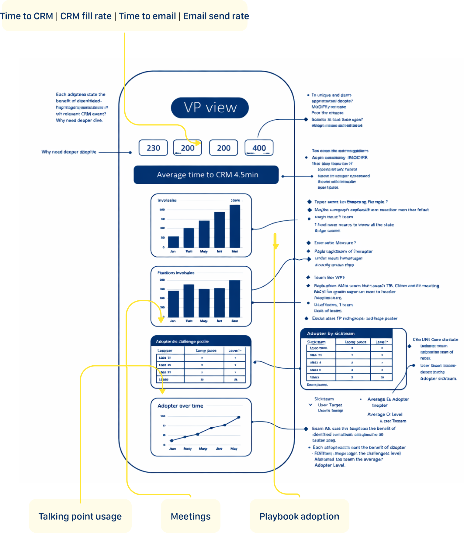
- Executive View: High-level impact metrics (Time to CRM | CRM fill rate | Time to email | Email send rate)
- Operational View: Day-to-day performance data (playbook adoption, talking points coverage)
- Coaching View: Granular rep-level insights (individual/team meeting counts, talking point gaps, playbook compliance over time)
Concept 1: The Focused Start
This concept leads with headline metric cards showing the numbers that matter most — time saved, meetings tracked, emails sent, tasks created. Below, horizontal bar charts and pie breakdowns make team comparisons effortless to scan. Further down, bubble charts and trend lines give a full picture of playbook adoption across teams over time, turning three months of activity into a single confident view.
User Feedback
Too much going on — I don't know where to look first. The talking points widget is a wall of tags with no clear hierarchy. The pie chart and bar chart show the same meetings data — why twice?
Concept 2: The Simplification
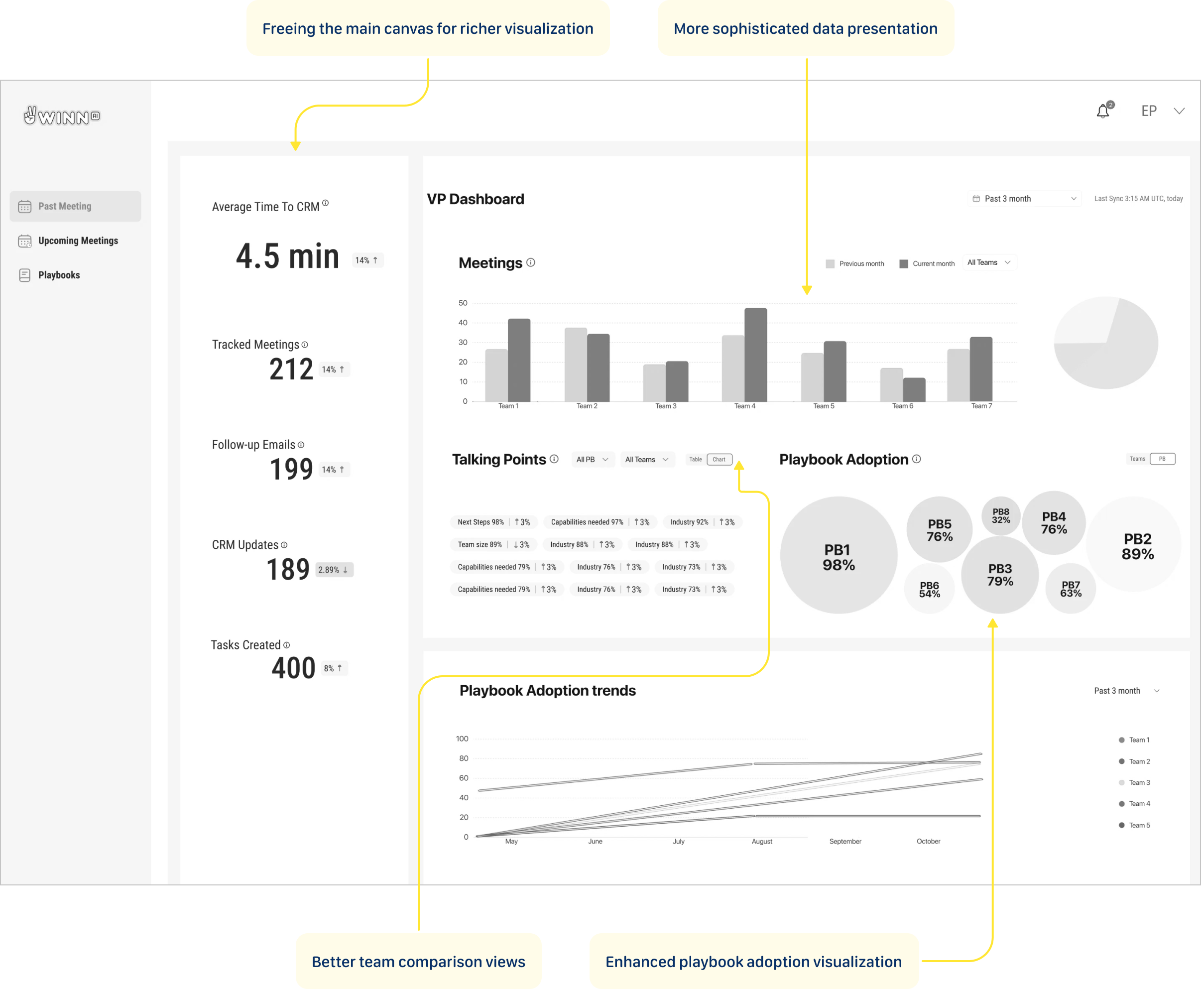
Metric cards moved to the left rail, freeing the main canvas for richer visualizations — grouped bar charts for team meeting comparisons, bubble clusters to show playbook adoption at a glance, and trend lines that reveal how each team is moving over three months. More data, less noise.
User Feedback
The metric cards are buried in the left sidebar — I have to hunt for the most important numbers. The bubble chart breaks the moment you have more than 8 playbooks — it won't scale. I need to scroll to see trends, but trends are what I open this dashboard for.
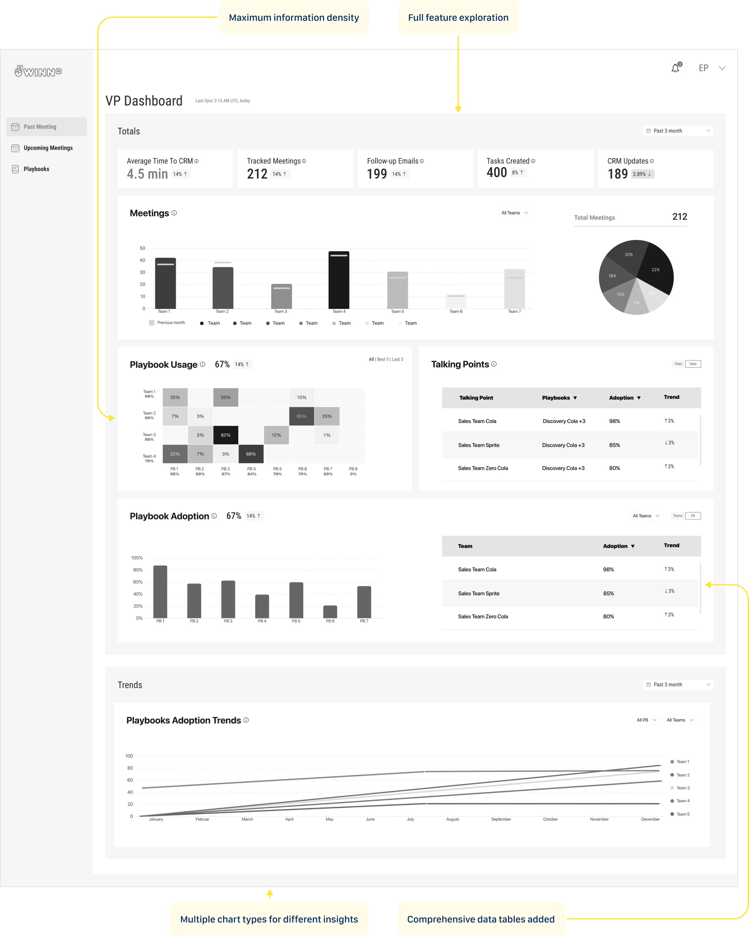
Concept 3: The Focus
This iteration pushed the dashboard further — layering in data tables alongside charts to give both a visual and numerical read on performance. Multiple chart types let different insights breathe in their own format. One deliberate call: playbook usage didn't make it onto the main view, but its value was clear enough to plan as a drill-down feature in the next version.
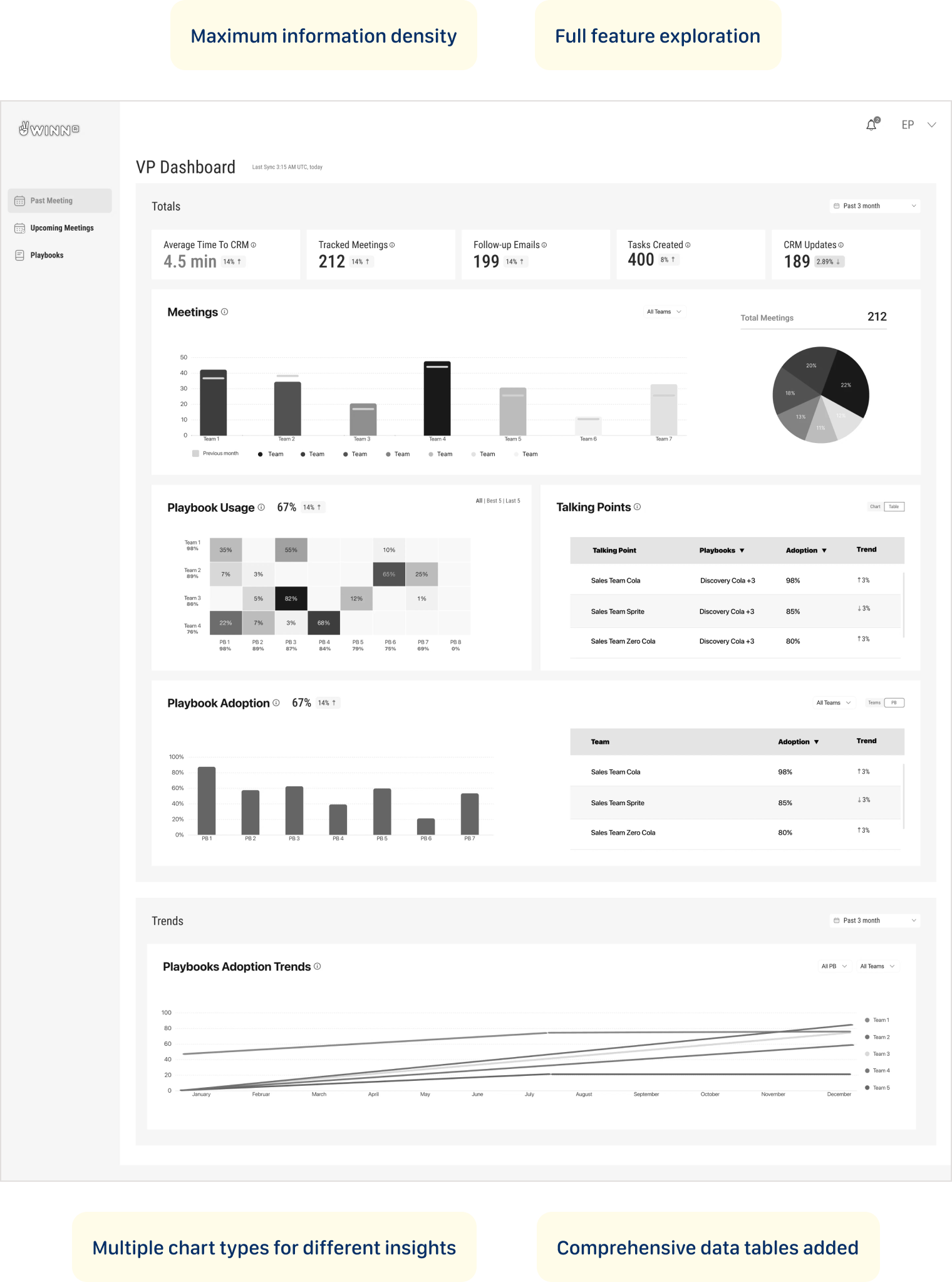
User Feedback
Playbook Usage and Playbook Adoption are two separate sections — they feel like the same thing. The heatmap completely breaks with more than 4 teams — it's not scalable at all. Too much scrolling to connect the numbers at the top to the trends at the bottom.
Dashboard tells the story
Solution
The Reality Check – Dashboard tells the story
Major pivot: Highly-rated playbook usage heat map moved to drill-down
With limited time and competing demands, I used a simple but effective criteria for feature prioritization:
- Business strategy alignment - what was a killing feature for our competitive advantage?
- Technical feasibility - what could our backend aggregations actually deliver in the given timeframe?
The Decision Trio: Major calls were made collaboratively between myself, the PM, and the company director (who brought valuable sales field experience to the table). This kept decisions grounded in both user needs and business reality.
Validation Approach
We didn't need traditional validation testing in this case - this was a startup environment with performance systems already in place. We could see the dynamics and impact ourselves in real-time, allowing for immediate course corrections based on actual usage patterns rather than theoretical testing scenarios.
Тhe dashboard fits into daily management routines
Delivery Success
User Response
Sales managers responded positively to the dashboard's ease of use and clarity in presenting complex data. The tool's seamless integration into their workflows significantly enhanced their ability to track playbook adoption and make data-driven decisions.
Key User Wins
- Effortless metric tracking - managers could monitor team performance at a glance
- Actionable coaching insights - real-time playbook adoption data enabled targeted interventions
- Workflow integration - the dashboard fit naturally into daily management routines
Competitive Advantage Proven
- Demonstrated our zero-minute time-to-CRM vs. industry benchmark of 4.5 minutes
- Showcased real-time capabilities against competitors' 5-60 minute delays
- Provided concrete ROI data to justify platform investment
What I'd Build Next
Looking Ahead: My Vision
The successful Phase 1 launch proved the concept and established user trust. Now we can build on that foundation with more sophisticated capabilities.
Transform Winn.ai's dashboard from a performance monitor into a sales optimization engine:
- AI-powered insights that suggest specific coaching actions
- Heatmap visualization of playbook adoption for trend analysis
- Benchmarking insights based on customer industry
These enhancements will offer a more comprehensive view, further supporting data-driven coaching and decision-making at all levels. The goal is to transform from a reporting tool into an intelligent coaching platform that not only shows what's happening, but recommends what to do about it.
What This Project Taught Me
My journey
I arrived at Winn.ai for my first day, walking into what would become a delightful moment.
"We need a sales dashboard," the Product Manager explained. "It's been announced to customers, the VP Sales is expecting it, and we have three weeks to deliver it. Oh, and we haven't started designing it yet."The Reality Check:
- 3-week hard deadline with customer commitments already made
- I had zero product knowledge - this was literally day one
- Junior developer on his first professional job as my only frontend resource
- "Research" = sketched wireframes and sticky notes
- Multiple stakeholders with conflicting needs (VP Sales, Sales Reps, Sales Managers)
The Stakes: Customer expectations were set, sales operations were waiting, and failure wasn't an option. It was fun.

What was a killing feature for our competitive advantage?

ABOUT ME


Playbook Adoption
Fintech | B2B
How can a dashboard be designed to drive sales optimization, not just performance monitoring?
Why This Problem Was Worth Solving
Background
Winn.ai is an AI-Powered Real-Time Sales Assistant Platform. AI-powered real-time sales assistant joins virtual meeting and helps sales reps focus more on customers by reducing administrative tasks: detecting customer answers during calls, immediately surfaces information for salespeople and updates CRM systems, and Improves productivity by automating note-taking and follow-up actions. While competitors offered post-call summaries with 5-60 minute delays, Winn.ai's unique value proposition was real-time insights during live calls with instant CRM synchronization.
Where Teams Were Losing Time
PAIN POINTS
“As a VP Sales I want track sales teams performance so that I can identify top performers, spot bottlenecks early, and make data-driven decisions to hit revenue targets.”
“As a Sales ManagerI want to track my team's performance and optimize playbooks so that I can close skill gaps faster and consistently hit our quarterly quota.”
“As a SDR I want to reduced time-to-CRM and faster follow-up emails so that I can focus more time on actual selling instead of admin work, and never let a hot lead go cold.”
“As a Winn.ai VP Sales I want to reduce paperwork to almost zero, proof of competitive differentiation and Platform to showcase real-time capabilities so that prospects immediately understand why we are different from Gong and Chorus, and choose us over the competition.”
"Our reps were spending 20 minutes after every single call. That's almost half a meeting just gone."
Where Teams Were Losing Time
main goal
Winn.ai claimed we could reduce it to almost zero. And Winn.ai decided to prove this. Create dashboard that will help
Customers:
- To increased team performance through better playbook adoption
- To reduced time-to-CRM (targeting 0 minutes vs. 4.5-minute industry benchmark)
- To enable sales managers to track team performance and optimize playbooks
Company:
- To demonstrate ROI to existing customers and prove our competitive advantage with measurable data
- To retain customers through demonstrated value
- To platform to showcase real-time capabilities
The Impact in Numbers
RESULTS
TIME TO CRM
20 min
1.5 min
Reps can reduce time spent on CRM admin by up to 85–98%.
FILL RATE
7%
63%
Customers reported 9x higher CRM fill rate.
PLAYBOOK ADOPTION
66%
82%
Live playbook coaching drives 2x higher improvement in playbook adoption.
PLAYBOOK ADOPTION
66%
82%
Live playbook coaching drives 2x higher improvement in playbook adoption.
Same interface, different perspective
OUTCOME
Rather than building different dashboards for VP Sales and Sales Team Leader, I found a way to satisfy everyone with one design: the "User vs. Team" Strategy: For VP Sales and Sales Managers, I created the same dashboard with one crucial difference - where Sales Managers saw "USERS" (individual rep data), the VP saw "TEAMS" (aggregated team data).
From drowning in post-meeting paperwork to reclaiming hours back in the day — these numbers tell the story of a team that stopped doing admin and started selling again.
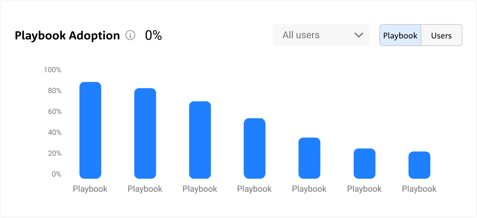
Not every playbook gets equal love — some are followed religiously, others barely touched. The chart exposes exactly where the gaps are, so managers can coach to reality, not assumption.
Some talking points land consistently, others get skipped almost every call — the data shows exactly where the conversation breaks down before it even gets started.
Adoption doesn't move in a straight line — it shifts, dips, and spikes over time, and the trends reveal which playbooks are gaining traction and which are quietly fading out.
322 meetings, up 34% — and at a glance, you can see exactly who's carrying the weight and where the drop-off begins.
3-week deadline
The start
It was my first day in the company. The PM's preliminary research consisted of 6 key metrics.Each stakeholder required completely different things:
- VP Sales: high-level executive view
- Sales Reps: operational metrics
- Sales Managers: rep performance
I made a strategic call: create one concept that would be suitable for all layers with small changes. This meant designing a flexible foundation that could scale up for executives and drill down for operations, while prioritizing the daily users who would make or break adoption.
Approach & Constraints
Three iterations in three days. I conducted daily 20-minute conversations with our 3 internal sales managers and director who actively used the Winn.ai system. I focused on understanding how a dashboard would help them and mapping their real workflow after analyzing dashboard data. Since they were actual users of our system, their feedback was invaluable for understanding practical needs rather than theoretical requirements.
VP Sales
- Cross-team performance overview at a glance
- Quarterly trends to track progress against revenue targets
- Instant visibility into which teams are ahead and which need attention
- Data to back every strategic decision in leadership meetings
Sales Managers
- Daily rep-level performance to know exactly who needs coaching
- Talking points and playbook adoption per individual
- Actionable insights to run sharper 1-on-1s
- Real-time signals to catch deals at risk before it's too late
Sales Reps
- Personal performance dashboard to track your own progress
- Clear visibility into which talking points and playbooks are working
- Less time on admin, more time on actual selling
- Real-time guidance during calls so nothing important gets missed
Winn.ai
- Proof of product impact through measurable time savings and adoption rates
- Real-world data to demonstrate competitive differentiation in sales conversations
- Customer success stories built directly from platform metrics
- A living showcase of how AI transforms sales execution, not just assists it
What Data Do We Actually Have — And What Can We Do With It?
The Process
I audited what data was available from Winn.ai to see what each persona actually needed to see. This led to a three-tier approach:
- Executive View: High-level impact metrics (Time to CRM | CRM fill rate | Time to email | Email send rate)
- Operational View: Day-to-day performance data (playbook adoption, talking points coverage)
- Coaching View: Granular rep-level insights (individual/team meeting counts, talking point gaps, playbook compliance over time)
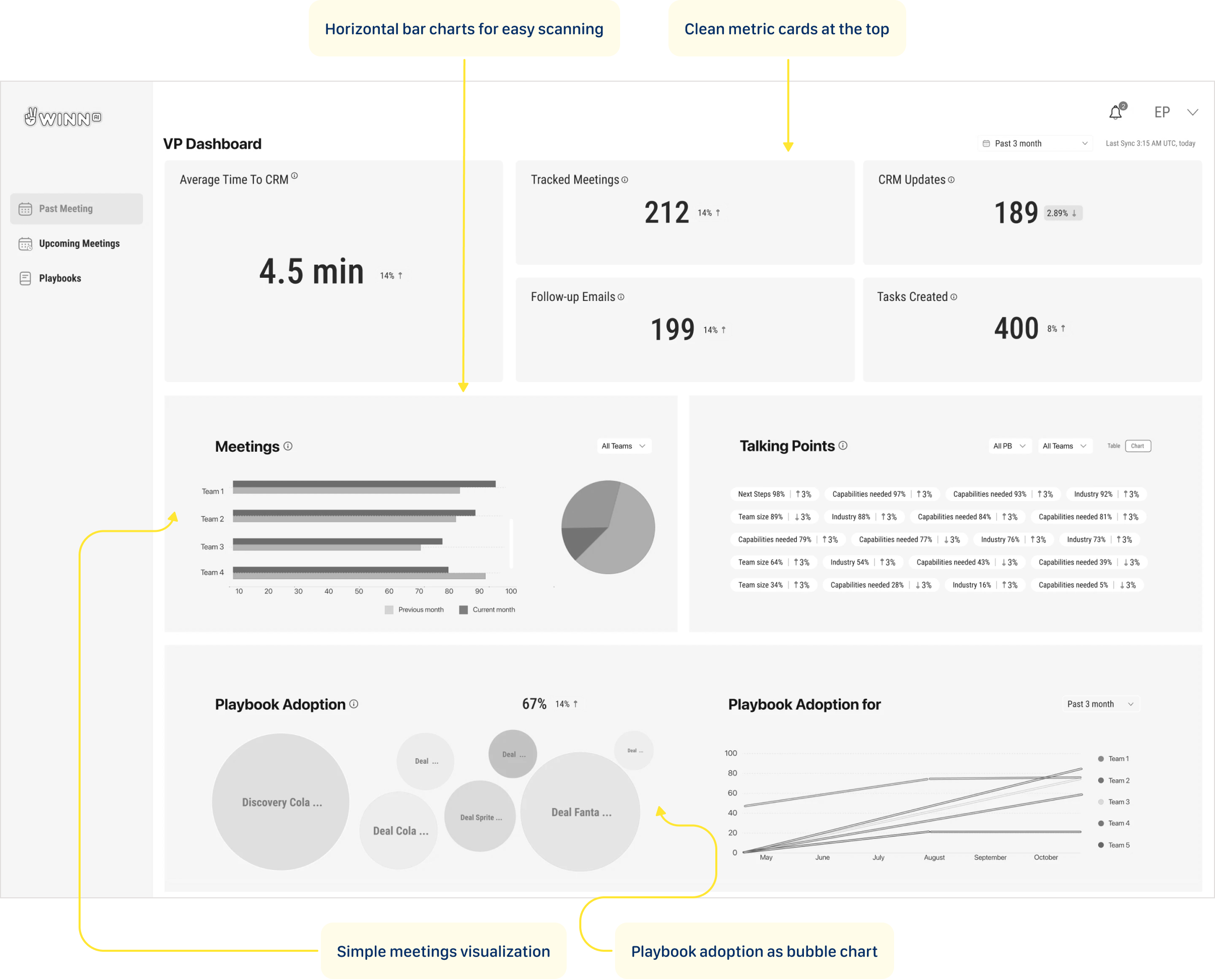
Concept 1: The Focused Start
This concept leads with headline metric cards showing the numbers that matter most — time saved, meetings tracked, emails sent, tasks created. Below, horizontal bar charts and pie breakdowns make team comparisons effortless to scan. Further down, bubble charts and trend lines give a full picture of playbook adoption across teams over time, turning three months of activity into a single confident view.
User Feedback
Too much going on — I don't know where to look first. The talking points widget is a wall of tags with no clear hierarchy. The pie chart and bar chart show the same meetings data — why twice?
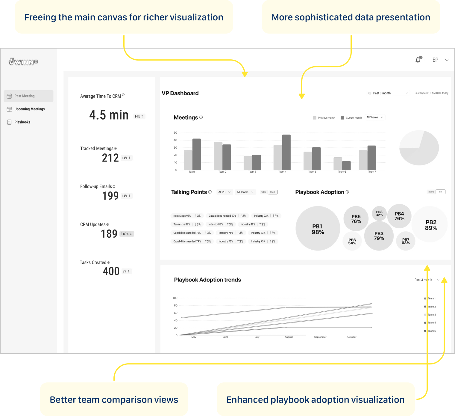
Concept 2: The Simplification
Metric cards moved to the left rail, freeing the main canvas for richer visualizations — grouped bar charts for team meeting comparisons, bubble clusters to show playbook adoption at a glance, and trend lines that reveal how each team is moving over three months. More data, less noise.
User Feedback
The metric cards are buried in the left sidebar — I have to hunt for the most important numbers. The bubble chart breaks the moment you have more than 8 playbooks — it won't scale. I need to scroll to see trends, but trends are what I open this dashboard for.
Concept 3: The Focus
This iteration pushed the dashboard further — layering in data tables alongside charts to give both a visual and numerical read on performance. Multiple chart types let different insights breathe in their own format. One deliberate call: playbook usage didn't make it onto the main view, but its value was clear enough to plan as a drill-down feature in the next version.
User Feedback
Playbook Usage and Playbook Adoption are two separate sections — they feel like the same thing. The heatmap completely breaks with more than 4 teams — it's not scalable at all. Too much scrolling to connect the numbers at the top to the trends at the bottom.
Dashboard tells the story
Solution
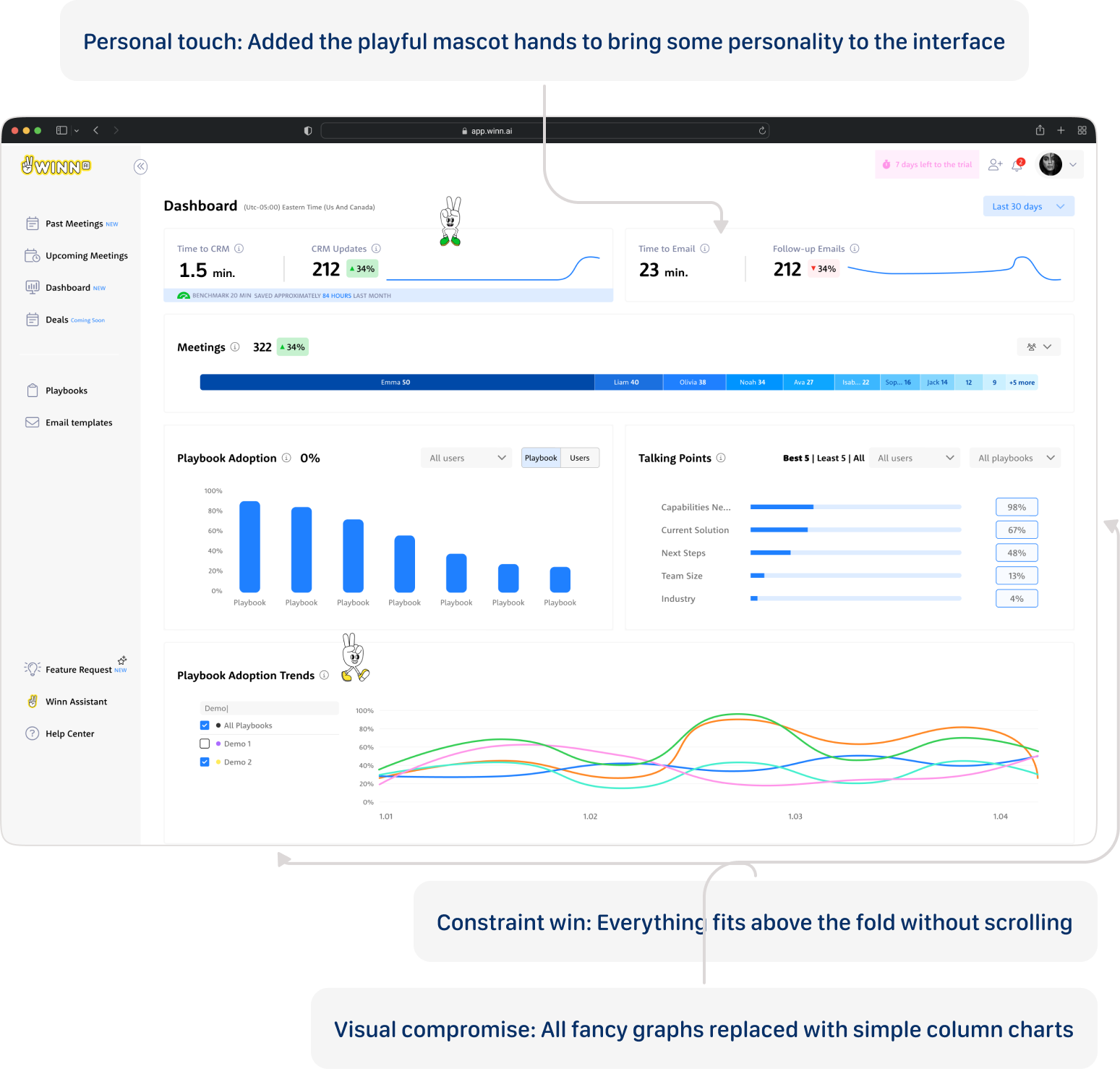
Personal touch: Added the playful mascot hands to bring some personality to the interface
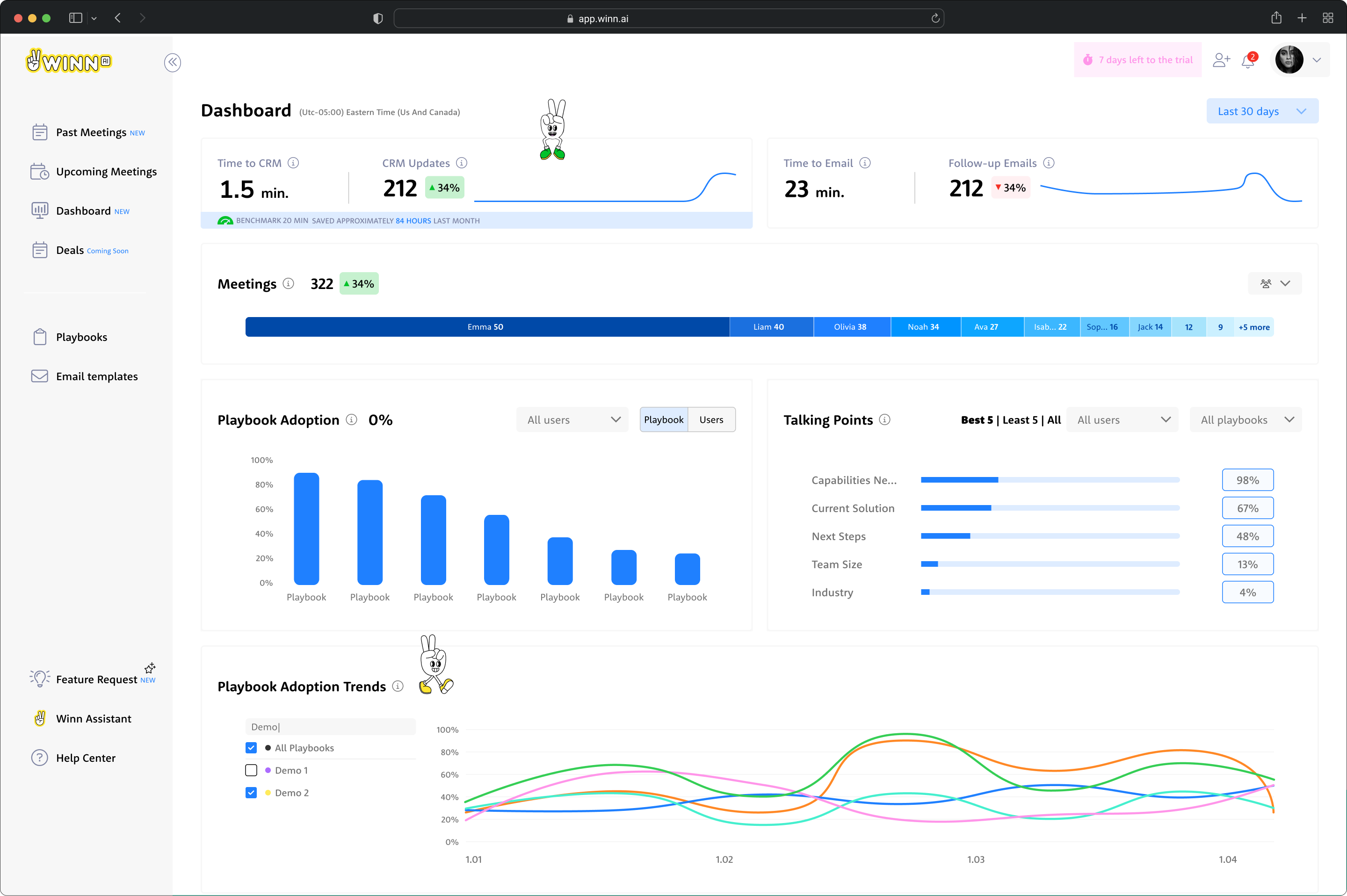
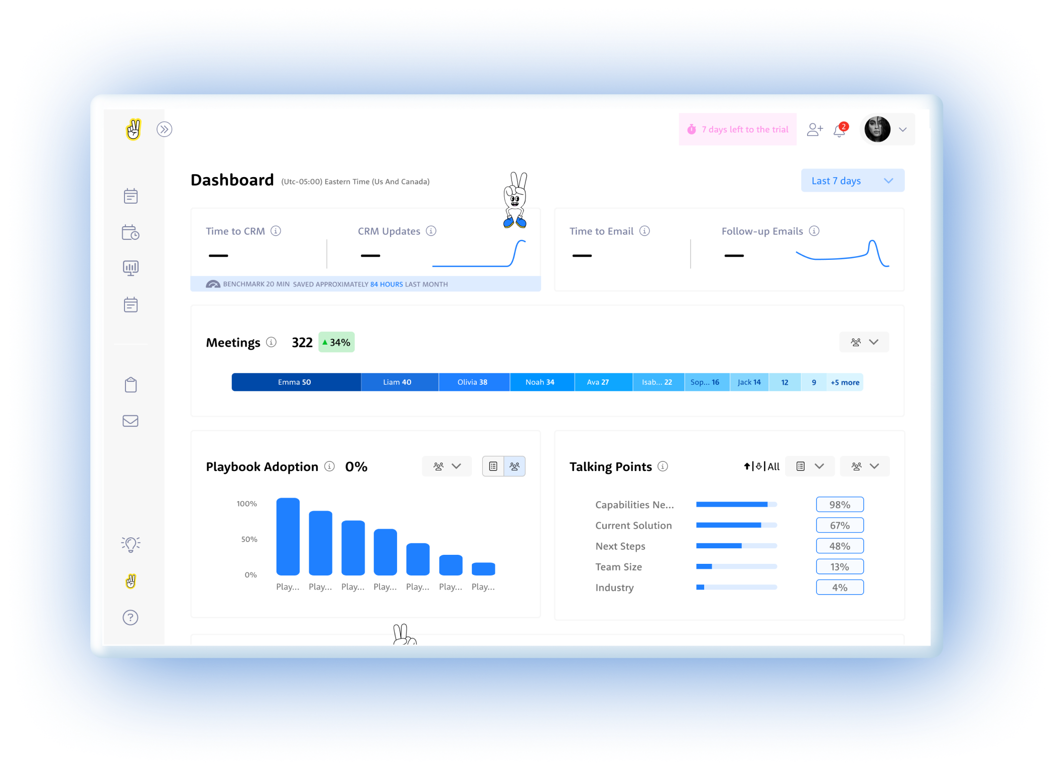
Constraint win: Everything fits above the fold without scrolling
Visual compromise: All fancy graphs replaced with simple column charts
Major pivot: Highly-rated playbook usage heat map moved to drill-down
With limited time and competing demands, I used a simple but effective criteria for feature prioritization:
- Business strategy alignment - what was a killing feature for our competitive advantage?
- Technical feasibility - what could our backend aggregations actually deliver in the given timeframe?
The Decision Trio: Major calls were made collaboratively between myself, the PM, and the company director (who brought valuable sales field experience to the table). This kept decisions grounded in both user needs and business reality.
Validation Approach
We didn't need traditional validation testing in this case - this was a startup environment with performance systems already in place. We could see the dynamics and impact ourselves in real-time, allowing for immediate course corrections based on actual usage patterns rather than theoretical testing scenarios.
Тhe dashboard fits into daily management routines
Delivery Success
User Response
Sales managers responded positively to the dashboard's ease of use and clarity in presenting complex data. The tool's seamless integration into their workflows significantly enhanced their ability to track playbook adoption and make data-driven decisions.
Key User Wins
- Effortless metric tracking - managers could monitor team performance at a glance
- Actionable coaching insights - real-time playbook adoption data enabled targeted interventions
- Workflow integration - the dashboard fit naturally into daily management routines
Competitive Advantage Proven
- Demonstrated our zero-minute time-to-CRM vs. industry benchmark of 4.5 minutes
- Showcased real-time capabilities against competitors' 5-60 minute delays
- Provided concrete ROI data to justify platform investment
What I'd Build Next
Looking Ahead: My Vision
The successful Phase 1 launch proved the concept and established user trust. Now we can build on that foundation with more sophisticated capabilities.
Transform Winn.ai's dashboard from a performance monitor into a sales optimization engine:
- AI-powered insights that suggest specific coaching actions
- Heatmap visualization of playbook adoption for trend analysis
- Benchmarking insights based on customer industry
These enhancements will offer a more comprehensive view, further supporting data-driven coaching and decision-making at all levels. The goal is to transform from a reporting tool into an intelligent coaching platform that not only shows what's happening, but recommends what to do about it.
What This Project Taught Me
My journey
I arrived at Winn.ai for my first day, walking into what would become a delightful moment.
"We need a sales dashboard," the Product Manager explained. "It's been announced to customers, the VP Sales is expecting it, and we have three weeks to deliver it. Oh, and we haven't started designing it yet."The Reality Check:
- 3-week hard deadline with customer commitments already made
- I had zero product knowledge - this was literally day one
- Junior developer on his first professional job as my only frontend resource
- "Research" = sketched wireframes and sticky notes
- Multiple stakeholders with conflicting needs (VP Sales, Sales Reps, Sales Managers)
The Stakes: Customer expectations were set, sales operations were waiting, and failure wasn't an option. It was fun.
What was a killing feature for our competitive advantage?


Playbook Adoption
Fintech | B2B
How can a dashboard be designed to drive sales optimization, not just performance monitoring?
Why This Problem Was Worth Solving
Background
Winn.ai is an AI-Powered Real-Time Sales Assistant Platform. AI-powered real-time sales assistant joins virtual meeting and helps sales reps focus more on customers by reducing administrative tasks: detecting customer answers during calls, immediately surfaces information for salespeople and updates CRM systems, and Improves productivity by automating note-taking and follow-up actions. While competitors offered post-call summaries with 5-60 minute delays, Winn.ai's unique value proposition was real-time insights during live calls with instant CRM synchronization.
Where Teams Were Losing Time
PAIN POINTS
“As a VP Sales I want track sales teams performance so that I can identify top performers, spot bottlenecks early, and make data-driven decisions to hit revenue targets.”
“As a Sales ManagerI want to track my team's performance and optimize playbooks so that I can close skill gaps faster and consistently hit our quarterly quota.”
“As a SDR I want to reduced time-to-CRM and faster follow-up emails so that I can focus more time on actual selling instead of admin work, and never let a hot lead go cold.”
“As a Winn.ai VP Sales I want to reduce paperwork to almost zero, proof of competitive differentiation and Platform to showcase real-time capabilities so that prospects immediately understand why we are different from Gong and Chorus, and choose us over the competition.”
"Our reps were spending 20 minutes after every single call. That's almost half a meeting just gone."
Where Teams Were Losing Time
main goal
Winn.ai claimed we could reduce it to almost zero. And Winn.ai decided to prove this. Create dashboard that will help
Customers:
- To increased team performance through better playbook adoption
- To reduced time-to-CRM (targeting 0 minutes vs. 4.5-minute industry benchmark)
- To enable sales managers to track team performance and optimize playbooks
Company:
- To demonstrate ROI to existing customers and prove our competitive advantage with measurable data
- To retain customers through demonstrated value
- To platform to showcase real-time capabilities
The Impact in Numbers
RESULTS
TIME TO CRM
20 min
1.5 min
Reps can reduce time spent on CRM admin by up to 85–98%.
FILL RATE
7%
63%
Customers reported 9x higher CRM fill rate.
PLAYBOOK ADOPTION
66%
82%
Live playbook coaching drives 2x higher improvement in playbook adoption.
Same interface, different perspective
OUTCOME
Rather than building different dashboards for VP Sales and Sales Team Leader, I found a way to satisfy everyone with one design: the "User vs. Team" Strategy: For VP Sales and Sales Managers, I created the same dashboard with one crucial difference - where Sales Managers saw "USERS" (individual rep data), the VP saw "TEAMS" (aggregated team data).
From drowning in post-meeting paperwork to reclaiming hours back in the day — these numbers tell the story of a team that stopped doing admin and started selling again.
Not every playbook gets equal love — some are followed religiously, others barely touched.
The chart exposes exactly where the gaps are, so managers can coach to reality, not assumption.
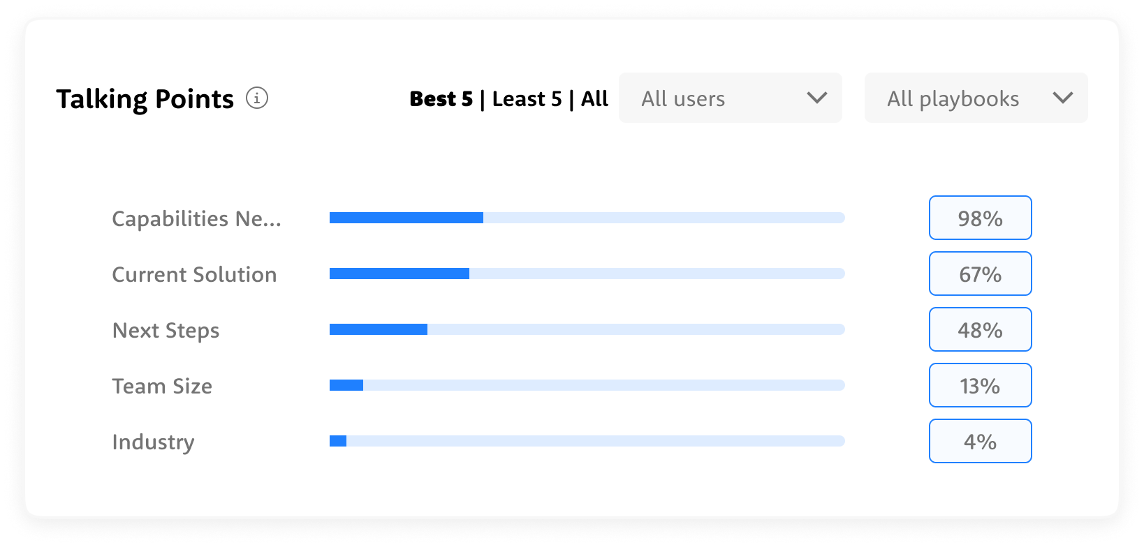
Some talking points land consistently, others get skipped almost every call — the data shows exactly where the conversation breaks down before it even gets started.
Adoption doesn't move in a straight line — it shifts, dips, and spikes over time, and the trends reveal which playbooks are gaining traction and which are quietly fading out.
322 meetings, up 34% — and at a glance, you can see exactly who's carrying the weight and where the drop-off begins.
3-week deadline
The start
It was my first day in the company. The PM's preliminary research consisted of 6 key metrics.Each stakeholder required completely different things:
- VP Sales: high-level executive view
- Sales Reps: operational metrics
- Sales Managers: rep performance
I made a strategic call: create one concept that would be suitable for all layers with small changes. This meant designing a flexible foundation that could scale up for executives and drill down for operations, while prioritizing the daily users who would make or break adoption.
Approach & Constraints
Three iterations in three days. I conducted daily 20-minute conversations with our 3 internal sales managers and director who actively used the Winn.ai system. I focused on understanding how a dashboard would help them and mapping their real workflow after analyzing dashboard data. Since they were actual users of our system, their feedback was invaluable for understanding practical needs rather than theoretical requirements.
VP Sales
- Cross-team performance overview at a glance
- Quarterly trends to track progress against revenue targets
- Instant visibility into which teams are ahead and which need attention
- Data to back every strategic decision in leadership meetings
Sales Managers
- Daily rep-level performance to know exactly who needs coaching
- Talking points and playbook adoption per individual
- Actionable insights to run sharper 1-on-1s
- Real-time signals to catch deals at risk before it's too late
Sales Reps
- Personal performance dashboard to track your own progress
- Clear visibility into which talking points and playbooks are working
- Less time on admin, more time on actual selling
- Real-time guidance during calls so nothing important gets missed
Winn.ai
- Proof of product impact through measurable time savings and adoption rates
- Real-world data to demonstrate competitive differentiation in sales conversations
- Customer success stories built directly from platform metrics
- A living showcase of how AI transforms sales execution, not just assists it
What Data Do We Actually Have — And What Can We Do With It?
The Process
I audited what data was available from Winn.ai to see what each persona actually needed to see. This led to a three-tier approach:
- Executive View: High-level impact metrics (Time to CRM | CRM fill rate | Time to email | Email send rate)
- Operational View: Day-to-day performance data (playbook adoption, talking points coverage)
- Coaching View: Granular rep-level insights (individual/team meeting counts, talking point gaps, playbook compliance over time)
Concept 1: The Focused Start
This concept leads with headline metric cards showing the numbers that matter most — time saved, meetings tracked, emails sent, tasks created. Below, horizontal bar charts and pie breakdowns make team comparisons effortless to scan. Further down, bubble charts and trend lines give a full picture of playbook adoption across teams over time, turning three months of activity into a single confident view.
User Feedback
Too much going on — I don't know where to look first. The talking points widget is a wall of tags with no clear hierarchy. The pie chart and bar chart show the same meetings data — why twice?
Concept 2: The Simplification
Metric cards moved to the left rail, freeing the main canvas for richer visualizations — grouped bar charts for team meeting comparisons, bubble clusters to show playbook adoption at a glance, and trend lines that reveal how each team is moving over three months. More data, less noise.
User Feedback
The metric cards are buried in the left sidebar — I have to hunt for the most important numbers. The bubble chart breaks the moment you have more than 8 playbooks — it won't scale. I need to scroll to see trends, but trends are what I open this dashboard for.
Concept 3: The Focus
This iteration pushed the dashboard further — layering in data tables alongside charts to give both a visual and numerical read on performance. Multiple chart types let different insights breathe in their own format. One deliberate call: playbook usage didn't make it onto the main view, but its value was clear enough to plan as a drill-down feature in the next version.
User Feedback
Playbook Usage and Playbook Adoption are two separate sections — they feel like the same thing. The heatmap completely breaks with more than 4 teams — it's not scalable at all. Too much scrolling to connect the numbers at the top to the trends at the bottom.
Dashboard tells the story
Solution
Personal touch: Added the playful mascot hands to bring some personality to the interface
Constraint win: Everything fits above the fold without scrolling
Visual compromise: All fancy graphs replaced with simple column charts
Major pivot: Highly-rated playbook usage heat map moved to drill-down
With limited time and competing demands, I used a simple but effective criteria for feature prioritization:
- Business strategy alignment - what was a killing feature for our competitive advantage?
- Technical feasibility - what could our backend aggregations actually deliver in the given timeframe?
The Decision Trio: Major calls were made collaboratively between myself, the PM, and the company director (who brought valuable sales field experience to the table). This kept decisions grounded in both user needs and business reality.
Validation Approach
We didn't need traditional validation testing in this case - this was a startup environment with performance systems already in place. We could see the dynamics and impact ourselves in real-time, allowing for immediate course corrections based on actual usage patterns rather than theoretical testing scenarios.
Тhe dashboard fits into daily management routines
Delivery Success
User Response
Sales managers responded positively to the dashboard's ease of use and clarity in presenting complex data. The tool's seamless integration into their workflows significantly enhanced their ability to track playbook adoption and make data-driven decisions.
Key User Wins
- Effortless metric tracking - managers could monitor team performance at a glance
- Actionable coaching insights - real-time playbook adoption data enabled targeted interventions
- Workflow integration - the dashboard fit naturally into daily management routines
Competitive Advantage Proven
- Demonstrated our zero-minute time-to-CRM vs. industry benchmark of 4.5 minutes
- Showcased real-time capabilities against competitors' 5-60 minute delays
- Provided concrete ROI data to justify platform investment
What I'd Build Next
Looking Ahead: My Vision
The successful Phase 1 launch proved the concept and established user trust. Now we can build on that foundation with more sophisticated capabilities.
Transform Winn.ai's dashboard from a performance monitor into a sales optimization engine:
- AI-powered insights that suggest specific coaching actions
- Heatmap visualization of playbook adoption for trend analysis
- Benchmarking insights based on customer industry
These enhancements will offer a more comprehensive view, further supporting data-driven coaching and decision-making at all levels. The goal is to transform from a reporting tool into an intelligent coaching platform that not only shows what's happening, but recommends what to do about it.
What This Project Taught Me
My journey
I arrived at Winn.ai for my first day, walking into what would become a delightful moment.
"We need a sales dashboard," the Product Manager explained. "It's been announced to customers, the VP Sales is expecting it, and we have three weeks to deliver it. Oh, and we haven't started designing it yet."The Reality Check:
- 3-week hard deadline with customer commitments already made
- I had zero product knowledge - this was literally day one
- Junior developer on his first professional job as my only frontend resource
- "Research" = sketched wireframes and sticky notes
- Multiple stakeholders with conflicting needs (VP Sales, Sales Reps, Sales Managers)
The Stakes: Customer expectations were set, sales operations were waiting, and failure wasn't an option. It was fun.
What was a killing feature for our competitive advantage?

ABOUT ME