Background
ZoomInfo is the GTM platform that helps businesses find, acquire and grow their customers. MarketingOS is a B2B demand generation and account-based marketing (ABM) platform that leverages comprehensive company and contact data to help marketers identify, target, and convert high-value accounts.
User Story
“As a DG manager I want to know which accounts have high levels of engagement so that I can provide a sales ready list of accounts to sales teams”
“As an Admin I want to ensure that our MQA criteria is aligned with the prospects the company is willing to invest in so that we efficiently manage SDRs time”
“As a SDR I want a vetted list of accounts with high levels of engagement so that I can target qualified prospects.”
Pain Point
Marketing operations managers with varying data literacy levels at B2B companies waste 5+ hours every week pulling campaign data from different tools, manually combining spreadsheets, and reformatting reports just to answer basic questions.
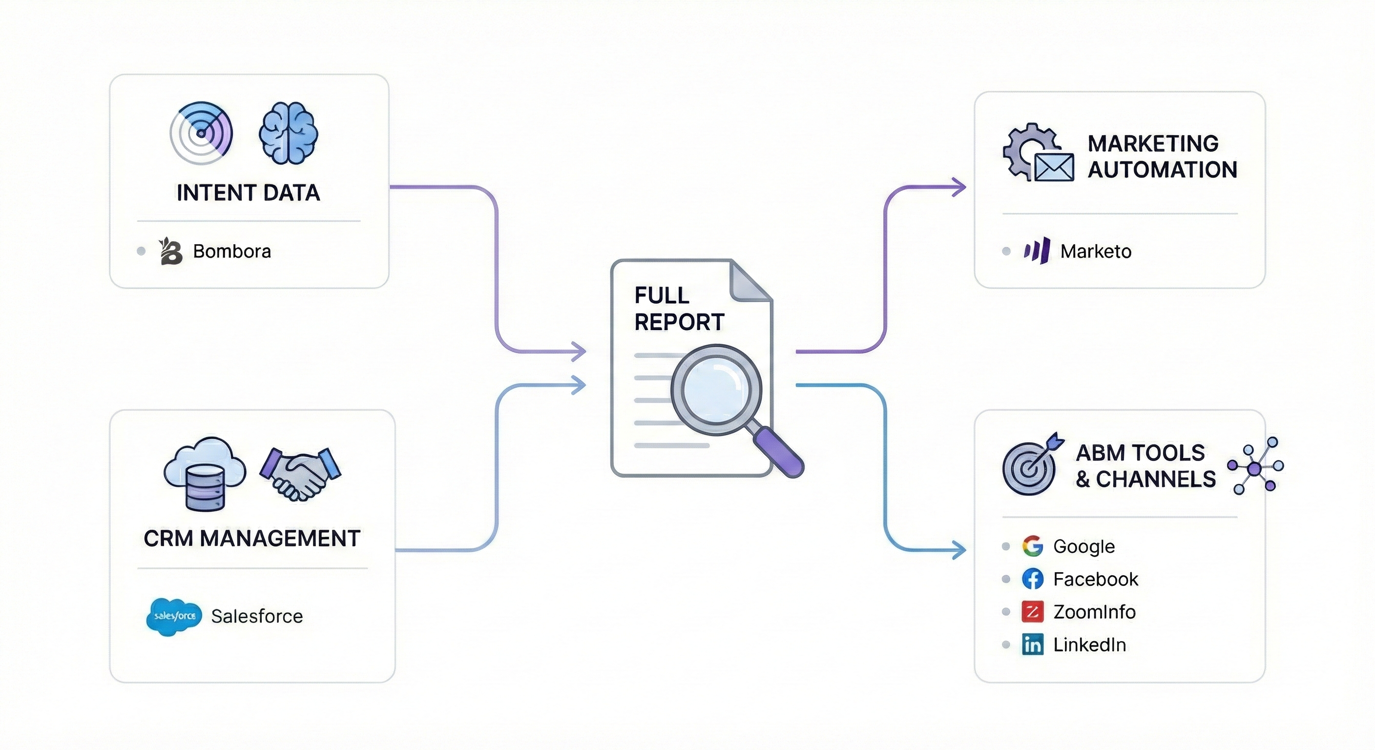
"Anne's daily workflow involved multiple platforms including Bombora for intent data, Marketo for marketing automation, Salesforce for CRM management, and various ABM tools, highlighting the fragmentation our solution needed to address."
Main goal
The tool should transform reporting from a time-consuming manual task into a fast, seamless workflow — freeing teams to focus on strategy rather than spreadsheets. It should deliver timely insights that enable confident decisions, strengthen advertiser relationships, and become a natural part of the managers’ weekly routine.
Outcome
Our solution addresses each identified user pain point through core design components, each carefully crafted to solve specific workflow challenges while supporting broader operational efficiency.
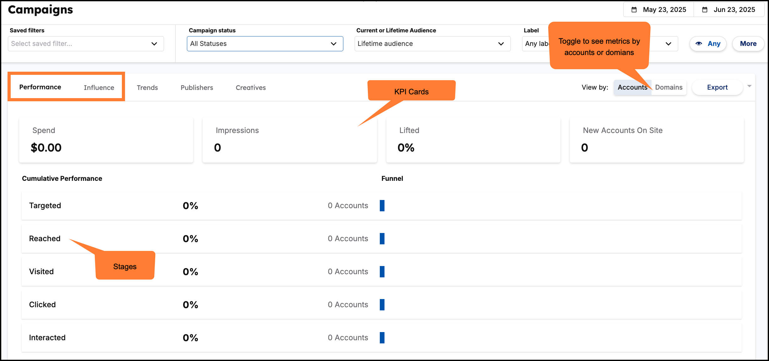
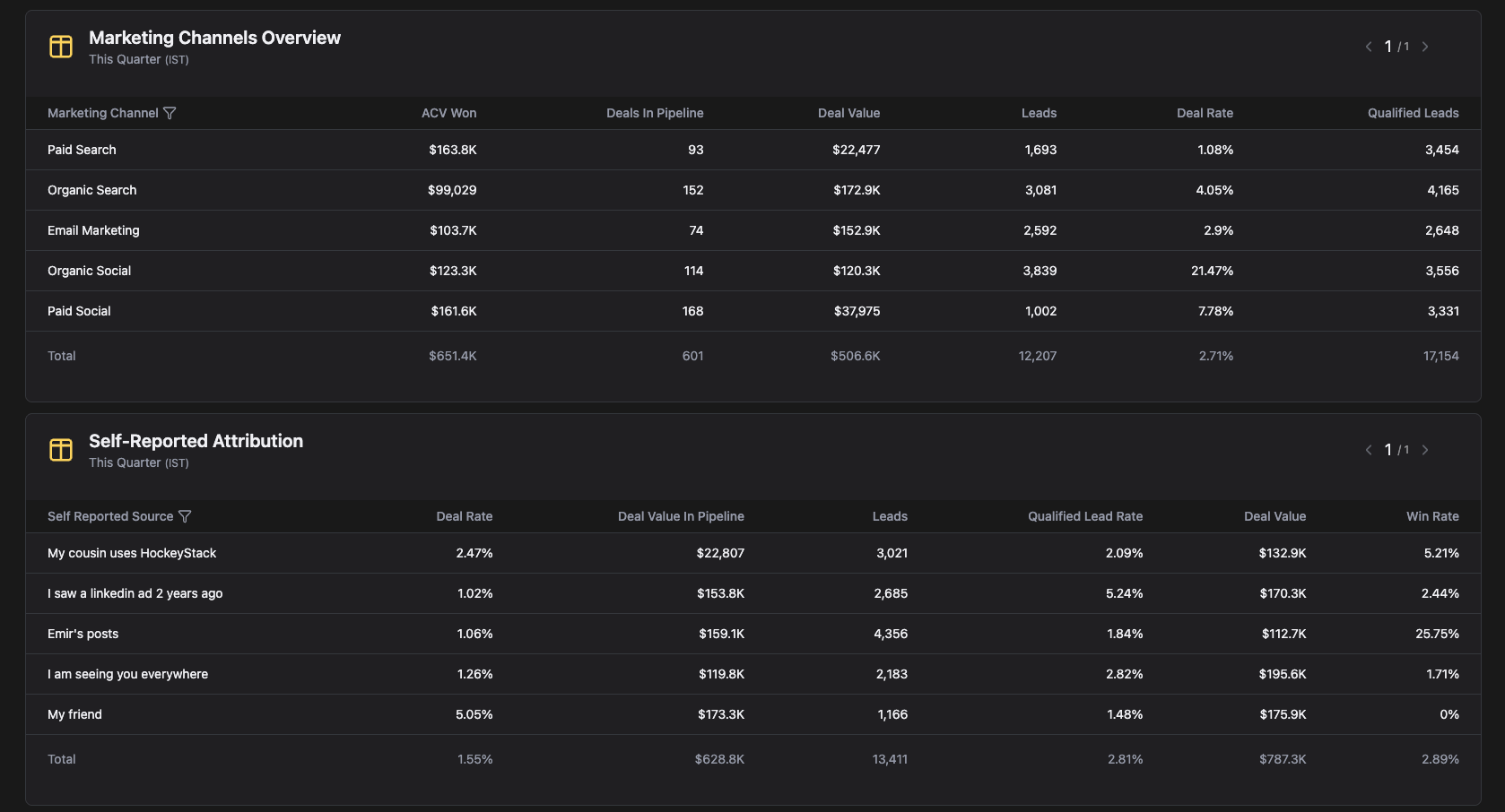
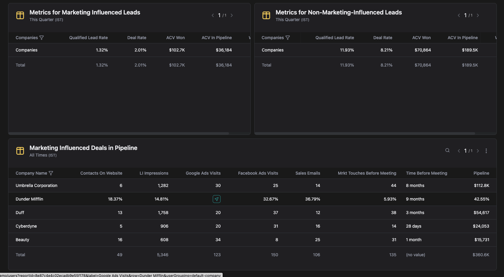
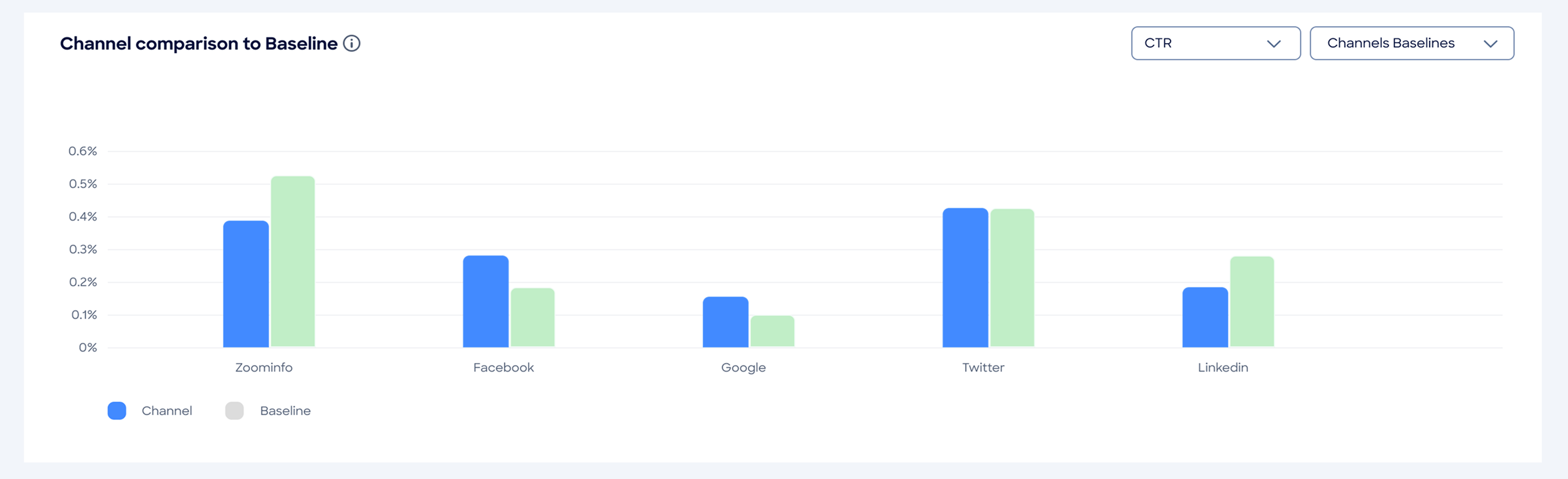
Top Engaged Accounts
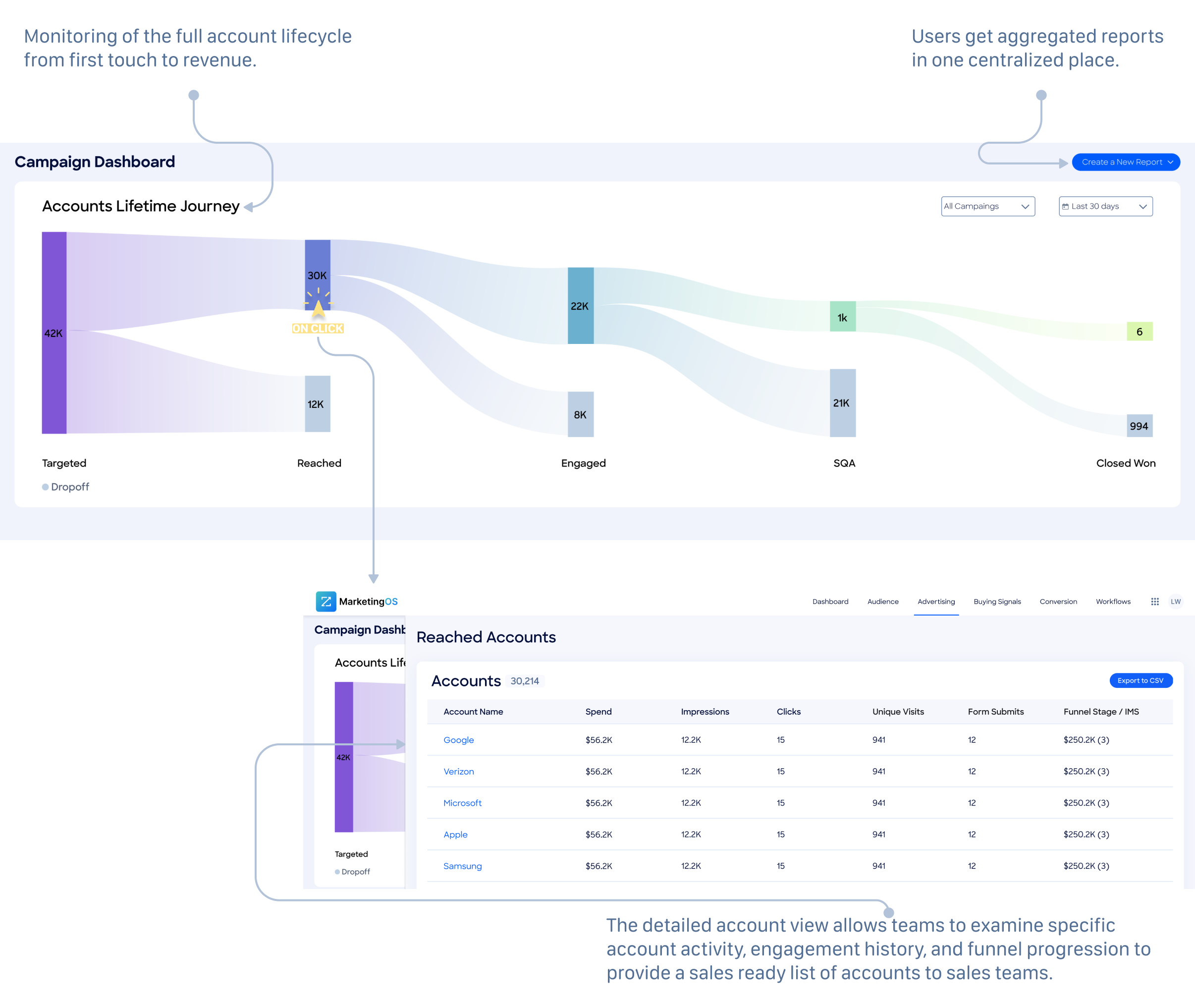
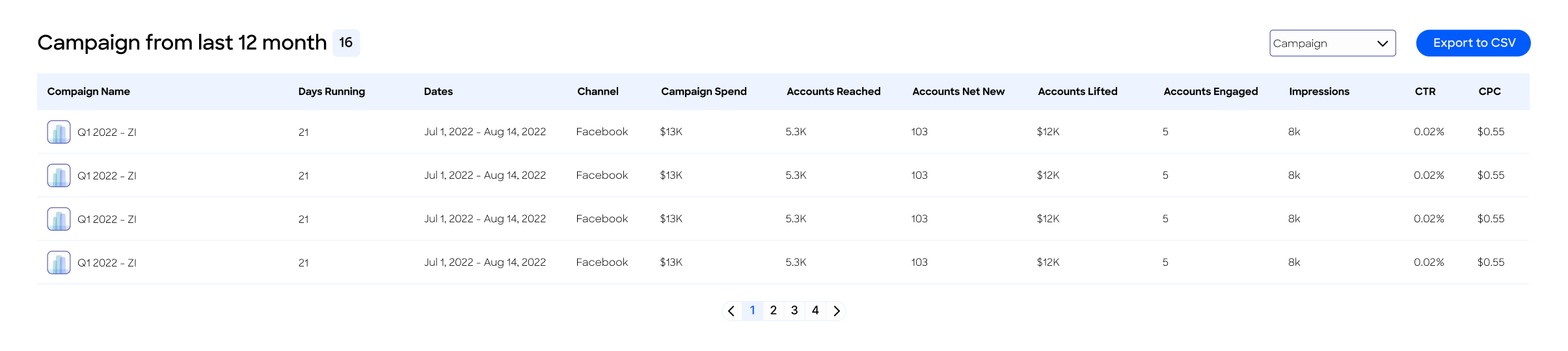
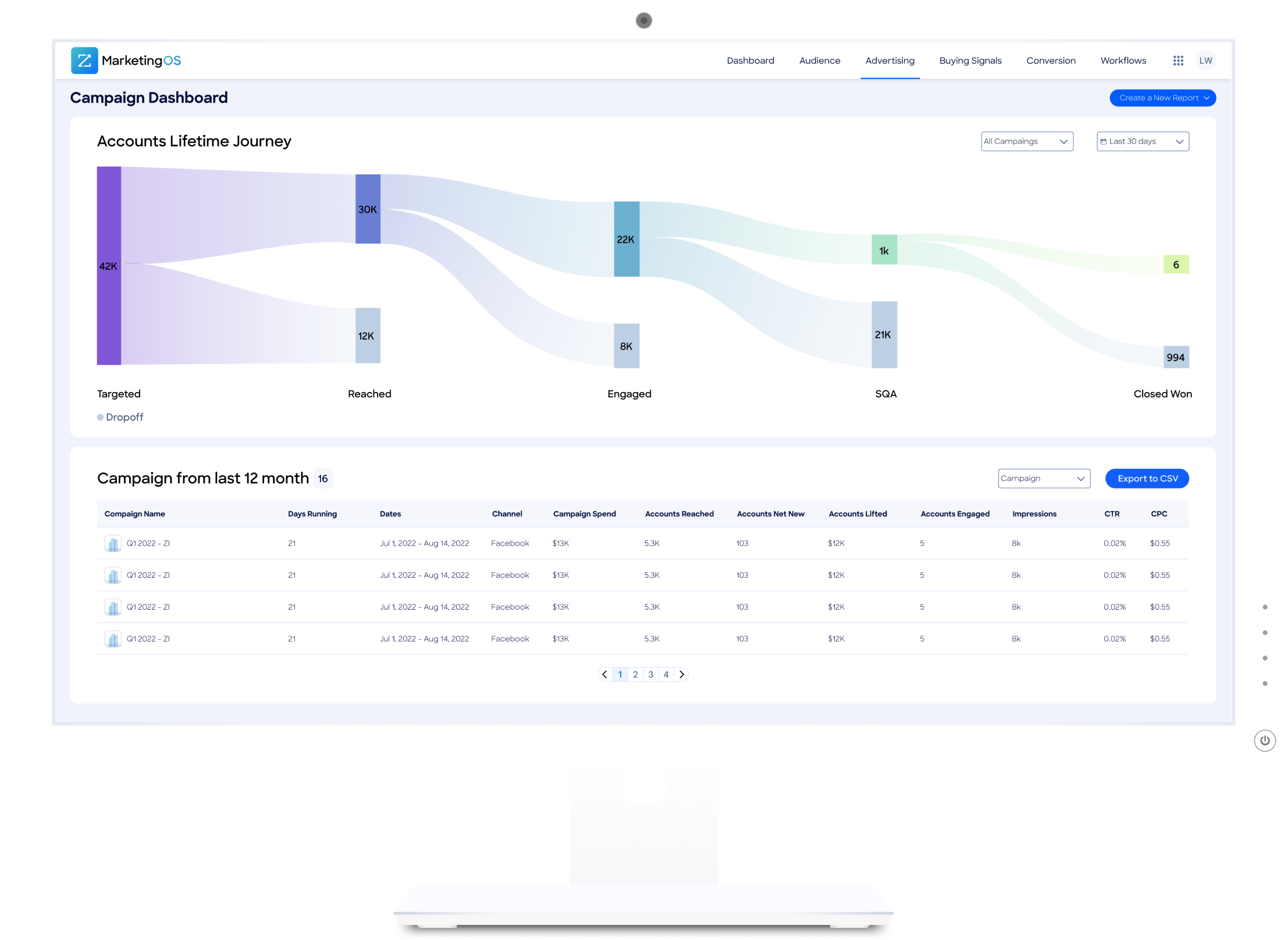
Campaign Table
At the bottom of the dashboard, the Campaigns from the past 12 months section provides another view of campaigns for the past 12 months. In this section, user can view metrics per campaign and switch to a monthly view to see a month-by-month breakdown and export the data from this table to a CSV file.
Results
Reduced Manual Reporting Time by
40%

Weekly reporting time reduced from an average of 5+ hours to under 3 hours.
Accelerated Insight Delivery by
83%
Insight delivery time reduced from 24+ hours to under 4 hours.
Increased Advertiser Spend by
5%
Within three months of launch. Users reported clearer visualization of account engagement.
Weekly Active Usage
75%
Among ABM managers with 2+ weekly usage within the first month.
The Process - Users Research
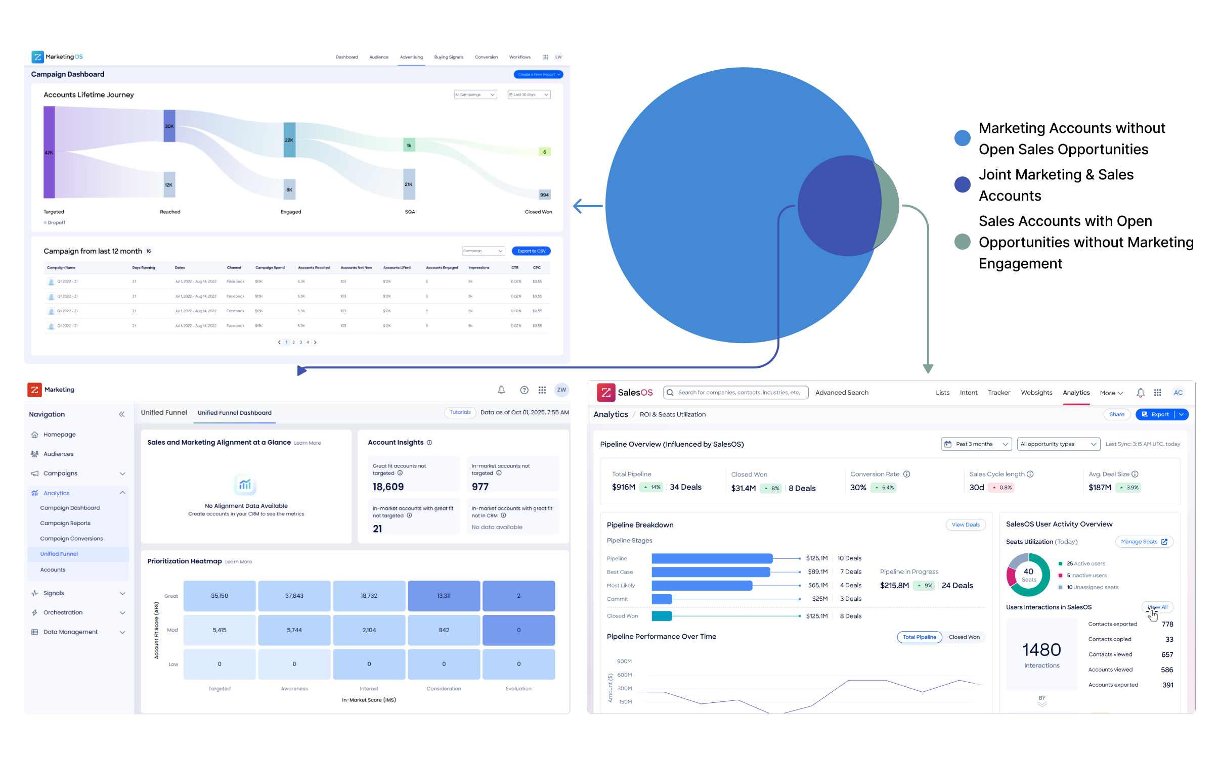
Marketing and sales operate in silos — marketing has no visibility into what happens to the leads they generate, and sales has no clear picture of where those leads came from. Without this alignment, measuring performance and building a coherent growth strategy becomes nearly impossible.To solve this, two teams worked in parallel to build a connected ecosystem: a Campaign Dashboard for marketing performance, a Pipeline Dashboard for sales, and a Unified Funnel Dashboard bridging both. My focus was the Campaign Dashboard — giving marketing teams full visibility into campaign performance, from first touch to closed won.
Approach & Constraints
We couldn’t interview customers directly due to B2B gatekeeping, so we partnered with Customer Success. They regularly speak with marketing ops managers and reported recurring issues: time-consuming data compilation and inconsistent reporting. Our analysis revealed primary areas of frustration for marketing operations managers:
Data Compilation Inefficiency
Account Prioritization Challenges
Report Inconsistency
Marketing Impact Visibility
Information Overload
Cross-Team Alignment
Solution Mapping
Workflows Mapping
We mapped out the three workflows marketing ops managers do most often to see exactly where things break down. Turns out, basic reporting tasks that should take 30 minutes were eating up entire afternoons.
Compiling Campaign Funnel Performance from Multiple Tools | ABM Manager | Weekly to monthly
Goal: Report on funnel metrics for current campaigns
Impact Analysis: Fully supported by dashboard design - eliminates manual data compilation and provides automated funnel visualization
Identifying Top-Performing Campaigns Across Accounts | Weekly optimization cycles | Performance Marketing Manager
Goal: Optimize spend by understanding channel and account performance
Impact Analysis: Partially supported - dashboard enables account prioritization and comparison but requires multi-channel integration for complete optimization
Supporting Sales with Ready-to-Convert Account Lists | Daily to weekly handoffs |
Marketing → Sales Enablement Lead
Goal: Pass warm, high-value accounts to sales teams
Impact Analysis: Foundation supported - dashboard provides exportable data that reduces manual preparation time but doesn't fully automate the sales handoff process
Persona
We tuned existing personas based on stakeholder interviews and customer feedback patterns. Our primary persona, Anne (VP Demand Generation), represented the core user challenges we aimed to solve:
goals
- Streamlined prospecting and lead generation processes
- Comprehensive ROI measurement across marketing activities
- Improved efficiency and scalability in marketing operations
- Enhanced alignment between marketing and sales teams
frustrations
- Campaign performance metrics captured on different platforms
- Lack of 360-degree view for informed decision-making
- Fragmented departmental collaboration affecting pipeline efficiency
- Incomplete customer journey visibility through the sales funnel
The Process - Market Research
Competitor analysis
We looked at what was already out there to see what marketing teams were stuck with.

Demandbase - oversimplified
- focused on account influence tracking with basic campaign metrics
- lacked comprehensive attribution and actionable insights of campaign performance


6sense - many screens
- excelled at intent data and account prioritization
- embedded campaign insights within broader sales tools rather than providing dedicated marketing operations functionality

HockeyStack - strong but complex
- the most comprehensive analytics with multi-touch attribution and lift modeling
- the overwhelming complexity for users seeking daily operational insights

The Process - Initial Concept Exploration
Data Architecture & Metrics Framework
We audited what data was available from ZoomInfo and our CRM to see what we could actually connect. This led to a three-tier approach:
- Executive View: High-level metrics for executives (win rate, pipeline velocity, deal size)
- Operational View: Dashboard metrics for daily operations (spend, attribution, channel performance)
- Analytical View: Detailed reports for deep analysis (demographics, granular attribution)
Concept 1: Timeline-Based Analytics Dashboard
This concept featured highlight cards displaying key performance metrics, followed by timeline-based graphs showing campaign performance trends over time. Below the visual layer, comprehensive data tables provided granular access to detailed metrics.
Key Features
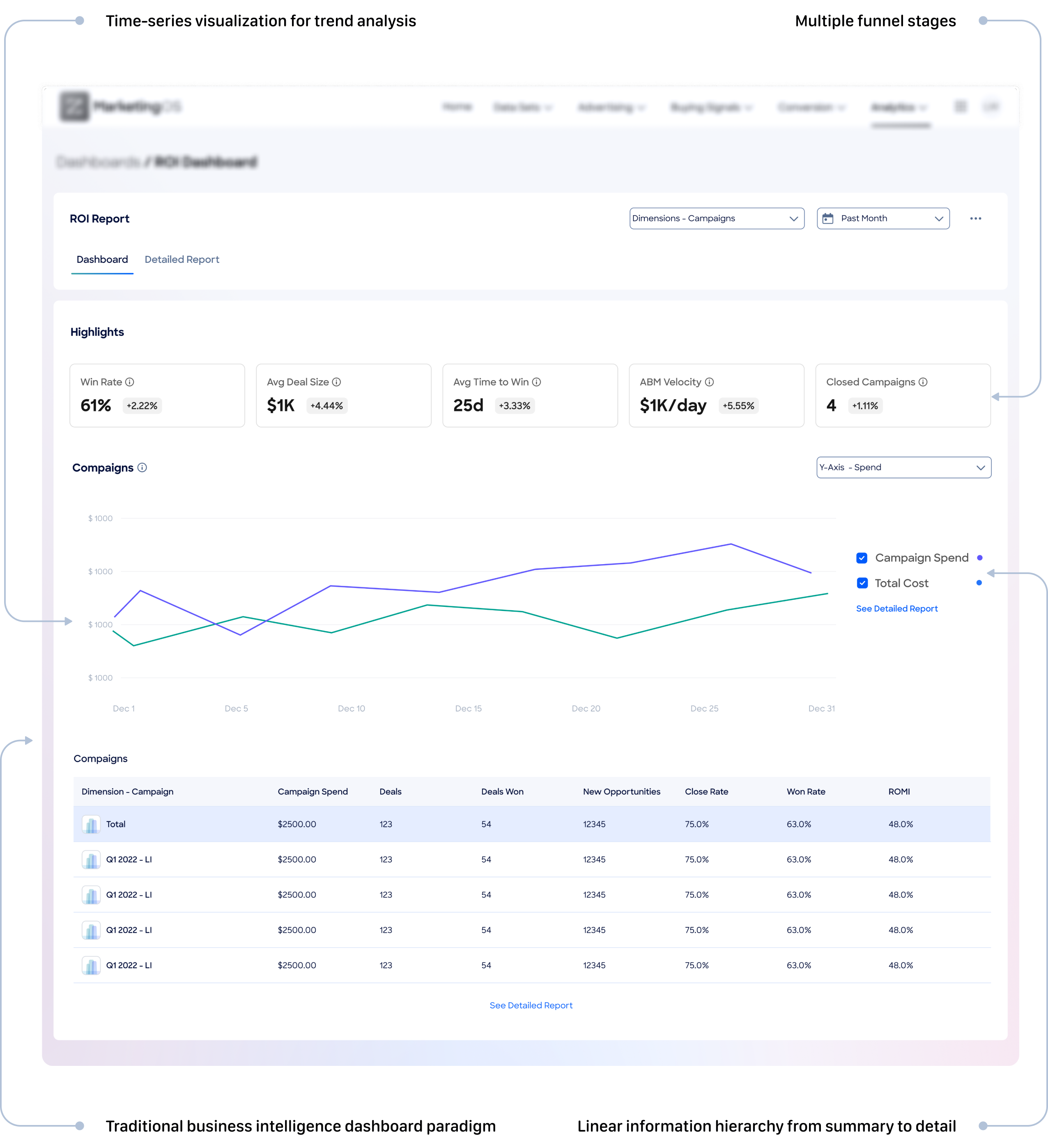
User Feedback
Users appreciated the familiar structure and comprehensive data access, but noted challenges in quickly identifying actionable insights and account prioritization opportunities.
Concept 2: Progressive Disclosure with Drill-Down Panels
The second concept emphasized focused exploration through interactive drill-down functionality. The main dashboard presented essential KPIs with click-to-explore interactions that opened detailed analysis panels on the right side of the interface.
Key Features
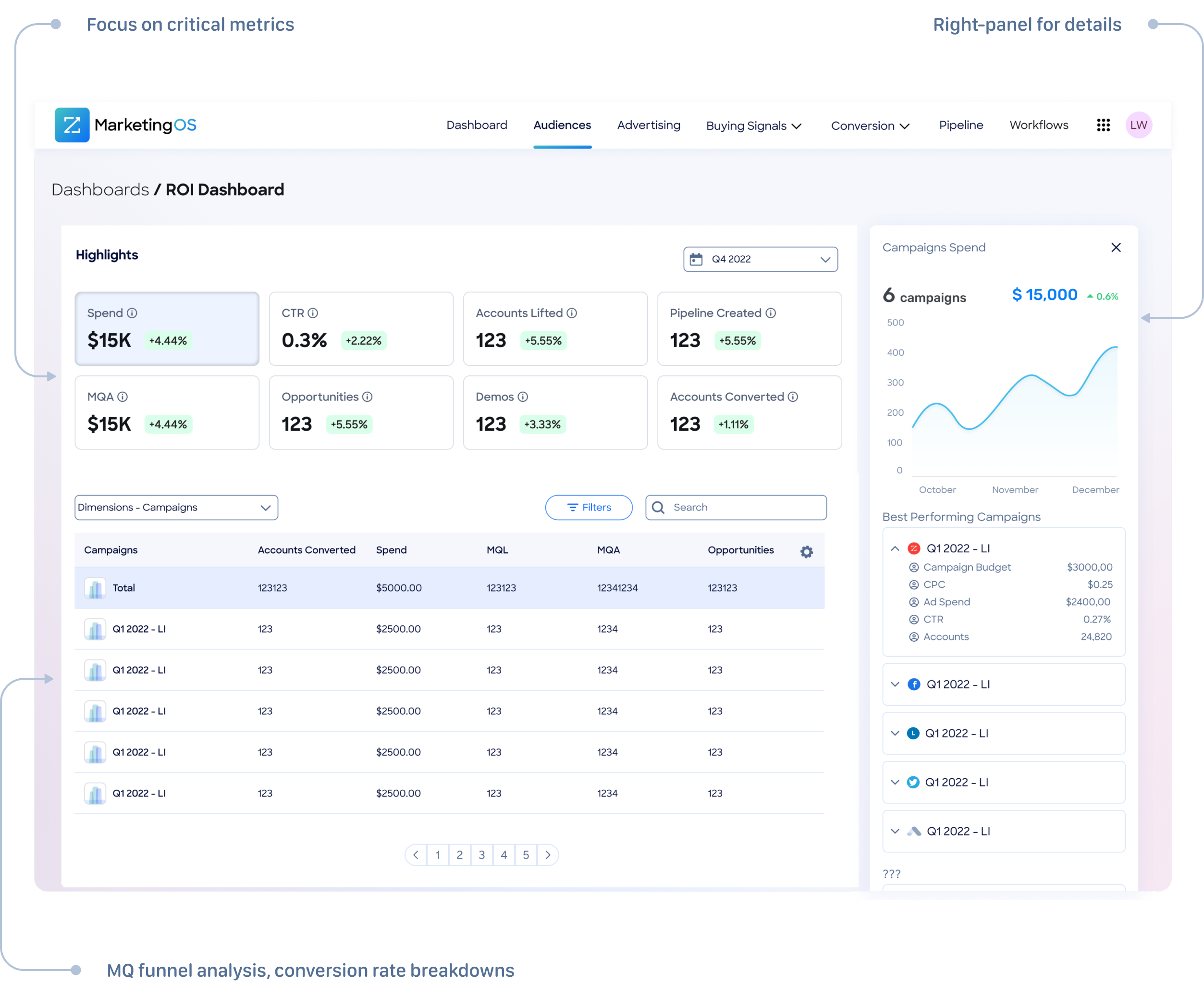
User Feedback
Users valued the focused approach and progressive disclosure model, finding it easier to maintain context while exploring detailed metrics. The interaction model reduced cognitive load compared to comprehensive dashboards.
Concept 3: Comprehensive Analytics Platform
Our third concept maximized information density with a traditional analytics platform approach. This design presented multiple visualization types simultaneously, including account funnel analysis, multi-channel spend breakdowns, campaign trend analysis, and detailed performance cards.
Key Features
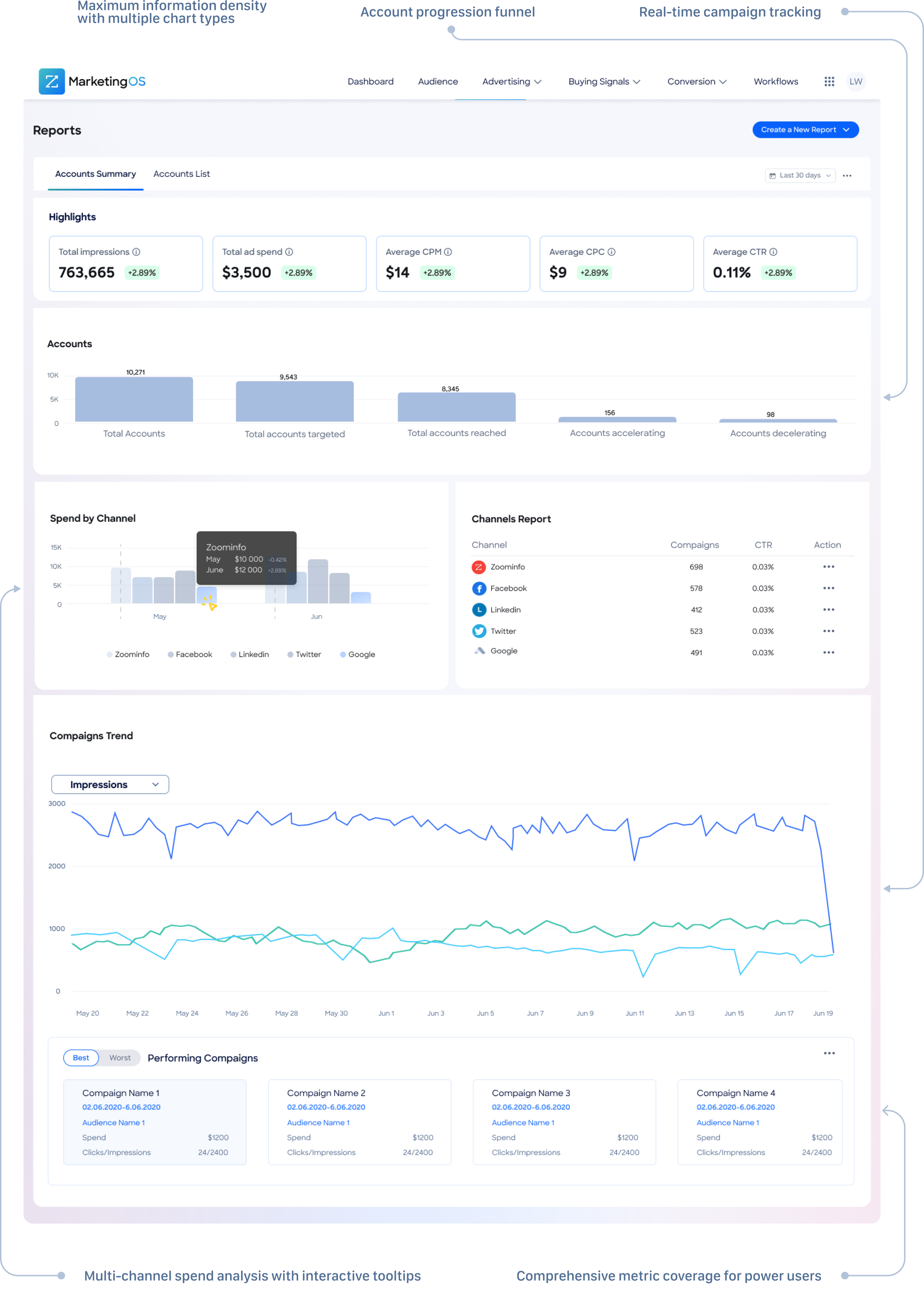
User Feedback
Users found the interface overwhelming despite appreciating the comprehensive data coverage. The cognitive load prevented quick decision-making and daily operational use.
The Process - Solution
Design Synthesis and Final Solution
Based on user feedback and pain point analysis, we synthesized elements from all three concepts into our final solution. The hybrid approach addressed the core insight that users needed both strategic overview and tactical detail without overwhelming complexity.
Validation and User Feedback
Post-launch interviews confirmed that our solution successfully addressed all primary pain points identified during research. Users specifically highlighted the elimination of manual data compilation, improved cross-team alignment through shared data sources, and enhanced ability to demonstrate marketing impact on pipeline progression. The combination of operational efficiency gains and business performance improvements validated our design approach and strategic prioritization decisions.
The Process - Testing
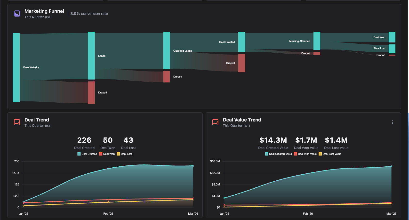
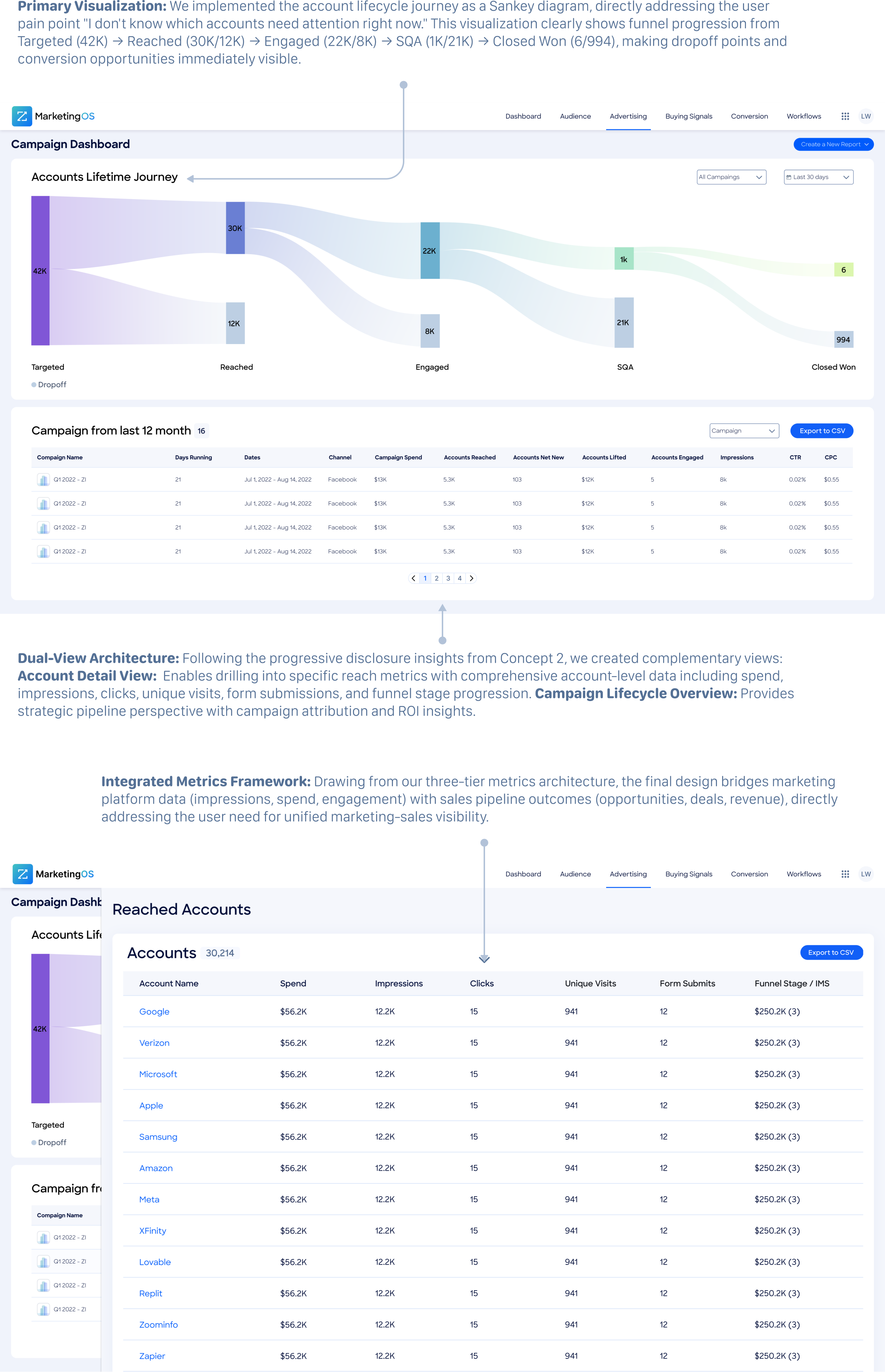
Early Concept Validation with ABM Managers ResultsThe most significant learning was that users conceptualize their work in terms of account journeys rather than isolated metrics. This validated our decision to prioritize the flow visualization over traditional dashboard layouts, confirming that the Sankey diagram addressed their fundamental mental model for understanding campaign effectiveness.
Iterative Usability Testing ResultsWe added clear entry points from Sankey diagram nodes to corresponding account details, creating intuitive pathways between strategic overview and tactical analysis. Export functionality was enhanced with template options for common reporting scenarios, reducing setup time for routine tasks.
Usage Pattern Analysis and Optimization ResultsWe made Sankey diagram nodes directly clickable to reduce friction in accessing account details, improving the discoverability of deeper analysis capabilities. Export workflows were simplified with streamlined options specifically designed for teams requiring basic reporting functionality.
Looking Ahead: My Vision
Based on user feedback and strategic product vision, I have identified key enhancement opportunities that will expand the platform's value and address evolving user needs in marketing operations.
Industry Benchmarking Integration: my immediate priority focuses on contextualizing campaign performance through industry-standard comparisons. Users consistently request the ability to understand whether their performance metrics represent competitive advantage or areas requiring improvement.
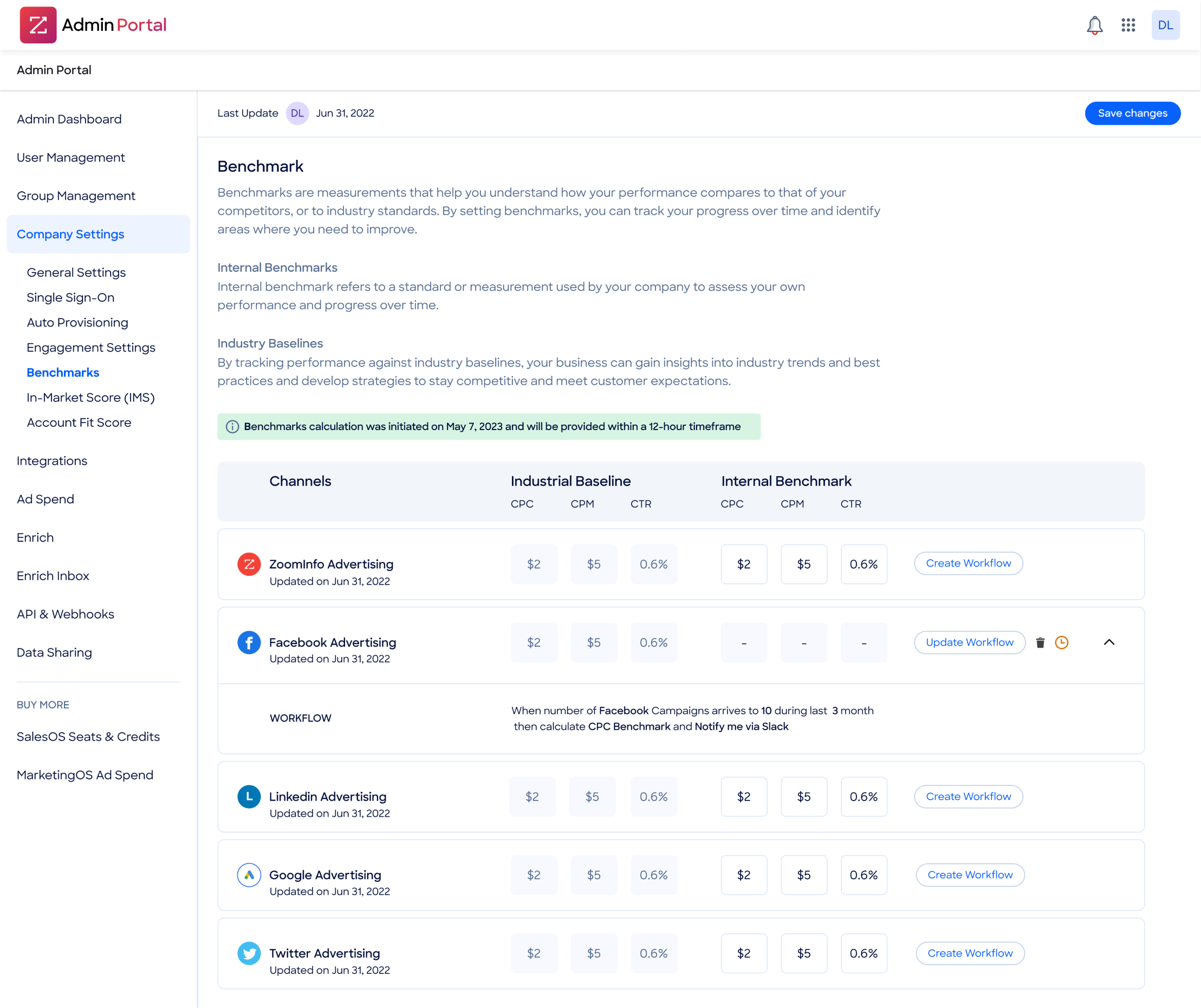
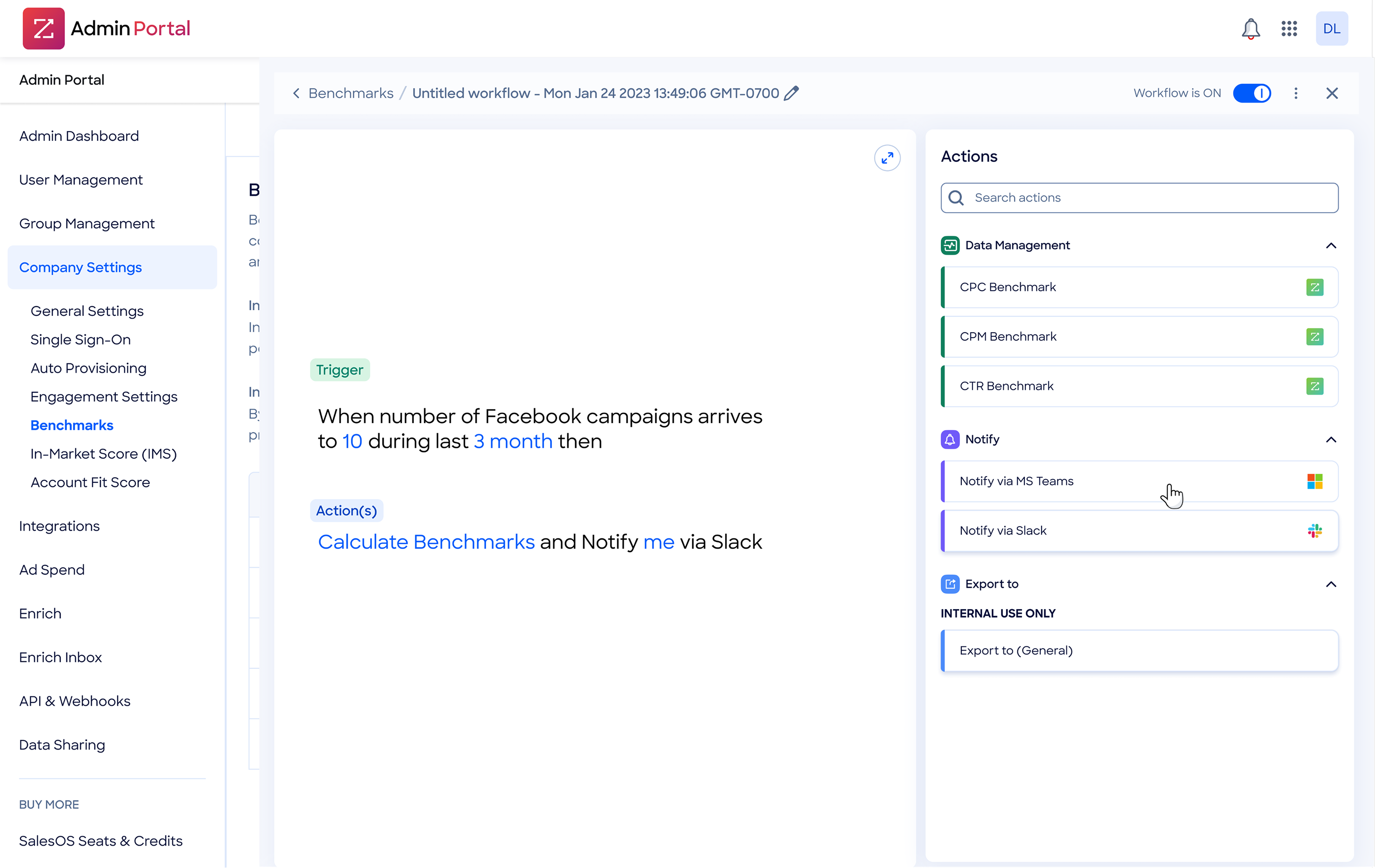
Automated Performance Monitoring and Alerting: Building on the benchmarking foundation, I will implement intelligent workflow automation that monitors campaign performance against established thresholds. The system will automatically calculate performance benchmarks and trigger notifications when campaigns deviate significantly from expected performance ranges.
Predictive Analytics and Optimization Recommendations: Leveraging the established benchmarking data and performance patterns, the platform will evolve to provide predictive insights and automated optimization recommendations.
This capability will transform the dashboard from reactive reporting to proactive campaign management.
My journey
It was a tremendous privilege at the beginning of my UX career to work on a project that exposed me to the entire UX lifecycle end to end. It gave me orientation within the financial domain, forced me to collaborate cross-functionally — from Customer Success to Development, through CRM integration teams and technical product managers — and taught me how complex systems truly operate.
Those months were an intense and exhilarating immersion into UX — the kind of experience that sharpens your thinking and makes you fall in love with the discipline all over again.
Fintech | B2B

ABOUT ME
Background
ZoomInfo is the GTM platform that helps businesses find, acquire and grow their customers. MarketingOS is a B2B demand generation and account-based marketing (ABM) platform that leverages comprehensive company and contact data to help marketers identify, target, and convert high-value accounts.
User Story
“As a DG manager I want to know which accounts have high levels of engagement so that I can provide a sales ready list of accounts to sales teams”
“As an Admin I want to ensure that our MQA criteria is aligned with the prospects the company is willing to invest in so that we efficiently manage SDRs time”
“As a SDR I want a vetted list of accounts with high levels of engagement so that I can target qualified prospects.”
Pain Point
Marketing operations managers with varying data literacy levels at B2B companies waste 5+ hours every week pulling campaign data from different tools, manually combining spreadsheets, and reformatting reports just to answer basic questions.
"Anne's daily workflow involved multiple platforms including Bombora for intent data, Marketo for marketing automation, Salesforce for CRM management, and various ABM tools, highlighting the fragmentation our solution needed to address."
Main goal
The tool should transform reporting from a time-consuming manual task into a fast, seamless workflow — freeing teams to focus on strategy rather than spreadsheets. It should deliver timely insights that enable confident decisions, strengthen advertiser relationships, and become a natural part of the managers’ weekly routine.
Outcome
Our solution addresses each identified user pain point through core design components, each carefully crafted to solve specific workflow challenges while supporting broader operational efficiency.
Top Engaged Accounts
Campaign Table
At the bottom of the dashboard, the Campaigns from the past 12 months section provides another view of campaigns for the past 12 months. In this section, user can view metrics per campaign and switch to a monthly view to see a month-by-month breakdown and export the data from this table to a CSV file.
Results

The Process - Users Research
Marketing and sales operate in silos — marketing has no visibility into what happens to the leads they generate, and sales has no clear picture of where those leads came from. Without this alignment, measuring performance and building a coherent growth strategy becomes nearly impossible.To solve this, two teams worked in parallel to build a connected ecosystem: a Campaign Dashboard for marketing performance, a Pipeline Dashboard for sales, and a Unified Funnel Dashboard bridging both. My focus was the Campaign Dashboard — giving marketing teams full visibility into campaign performance, from first touch to closed won.
Approach & Constraints
We couldn’t interview customers directly due to B2B gatekeeping, so we partnered with Customer Success. They regularly speak with marketing ops managers and reported recurring issues: time-consuming data compilation and inconsistent reporting. Our analysis revealed primary areas of frustration for marketing operations managers:
Data Compilation Inefficiency
Account Prioritization Challenges
Report Inconsistency
Marketing Impact Visibility
Information Overload
Cross-Team Alignment
Solution Mapping
Workflows Mapping
We mapped out the three workflows marketing ops managers do most often to see exactly where things break down. Turns out, basic reporting tasks that should take 30 minutes were eating up entire afternoons.
Compiling Campaign Funnel Performance from Multiple Tools
|
ABM Manager
|
Weekly to monthly
Goal: Report on funnel metrics for current campaigns
Impact Analysis: Fully supported by dashboard design - eliminates manual data compilation and provides automated funnel visualization
Identifying Top-Performing Campaigns Across Accounts
|
Weekly optimization cycles
|
Performance Marketing Manager
Goal: Optimize spend by understanding channel and account performance
Impact Analysis: Partially supported - dashboard enables account prioritization and comparison but requires multi-channel integration for complete optimization
Supporting Sales with Ready-to-Convert Account Lists
|
Daily to weekly handoffs
|
Marketing → Sales Enablement Lead
Goal: Pass warm, high-value accounts to sales teams
Impact Analysis: Foundation supported - dashboard provides exportable data that reduces manual preparation time but doesn't fully automate the sales handoff process
Persona
We tuned existing personas based on stakeholder interviews and customer feedback patterns. Our primary persona, Anne (VP Demand Generation), represented the core user challenges we aimed to solve:
goals
- Streamlined prospecting and lead generation processes
- Comprehensive ROI measurement across marketing activities
- Improved efficiency and scalability in marketing operations
- Enhanced alignment between marketing and sales teams
frustrations
- Campaign performance metrics captured on different platforms
- Lack of 360-degree view for informed decision-making
- Fragmented departmental collaboration affecting pipeline efficiency
- Incomplete customer journey visibility through the sales funnel
The Process - Market Research
Competitor analysis
We looked at what was already out there to see what marketing teams were stuck with.
Demandbase - oversimplified
- focused on account influence tracking with basic campaign metrics
- lacked comprehensive attribution and actionable insights of campaign performance

6sense - many screens
- excelled at intent data and account prioritization
- embedded campaign insights within broader sales tools rather than providing dedicated marketing operations functionality

HockeyStack - strong but complex
- the most comprehensive analytics with multi-touch attribution and lift modeling
- the overwhelming complexity for users seeking daily operational insights

The Process - Initial Concept Exploration
Data Architecture & Metrics Framework
We audited what data was available from ZoomInfo and our CRM to see what we could actually connect. This led to a three-tier approach:
- Executive View: High-level metrics for executives (win rate, pipeline velocity, deal size)
- Operational View: Dashboard metrics for daily operations (spend, attribution, channel performance)
- Analytical View: Detailed reports for deep analysis (demographics, granular attribution)
Concept 1: Timeline-Based Analytics Dashboard
This concept featured highlight cards displaying key performance metrics, followed by timeline-based graphs showing campaign performance trends over time. Below the visual layer, comprehensive data tables provided granular access to detailed metrics.
Key Features
User Feedback
Users appreciated the familiar structure and comprehensive data access, but noted challenges in quickly identifying actionable insights and account prioritization opportunities.
Concept 2: Progressive Disclosure with Drill-Down Panels
The second concept emphasized focused exploration through interactive drill-down functionality. The main dashboard presented essential KPIs with click-to-explore interactions that opened detailed analysis panels on the right side of the interface.
Key Features
User Feedback
Users valued the focused approach and progressive disclosure model, finding it easier to maintain context while exploring detailed metrics. The interaction model reduced cognitive load compared to comprehensive dashboards.
Concept 3: Comprehensive Analytics Platform
Our third concept maximized information density with a traditional analytics platform approach. This design presented multiple visualization types simultaneously, including account funnel analysis, multi-channel spend breakdowns, campaign trend analysis, and detailed performance cards.
Key Features
User Feedback
Users found the interface overwhelming despite appreciating the comprehensive data coverage. The cognitive load prevented quick decision-making and daily operational use.
The Process - Solution
Design Synthesis and Final Solution
Based on user feedback and pain point analysis, we synthesized elements from all three concepts into our final solution. The hybrid approach addressed the core insight that users needed both strategic overview and tactical detail without overwhelming complexity.

Validation and User Feedback
Post-launch interviews confirmed that our solution successfully addressed all primary pain points identified during research. Users specifically highlighted the elimination of manual data compilation, improved cross-team alignment through shared data sources, and enhanced ability to demonstrate marketing impact on pipeline progression. The combination of operational efficiency gains and business performance improvements validated our design approach and strategic prioritization decisions.
The Process - Testing
Early Concept Validation with ABM Managers ResultsThe most significant learning was that users conceptualize their work in terms of account journeys rather than isolated metrics. This validated our decision to prioritize the flow visualization over traditional dashboard layouts, confirming that the Sankey diagram addressed their fundamental mental model for understanding campaign effectiveness.
Iterative Usability Testing ResultsWe added clear entry points from Sankey diagram nodes to corresponding account details, creating intuitive pathways between strategic overview and tactical analysis. Export functionality was enhanced with template options for common reporting scenarios, reducing setup time for routine tasks.
Usage Pattern Analysis and Optimization ResultsWe made Sankey diagram nodes directly clickable to reduce friction in accessing account details, improving the discoverability of deeper analysis capabilities. Export workflows were simplified with streamlined options specifically designed for teams requiring basic reporting functionality.
Looking Ahead: My Vision
Based on user feedback and strategic product vision, I have identified key enhancement opportunities that will expand the platform's value and address evolving user needs in marketing operations.
Industry Benchmarking Integration: my immediate priority focuses on contextualizing campaign performance through industry-standard comparisons. Users consistently request the ability to understand whether their performance metrics represent competitive advantage or areas requiring improvement.
Automated Performance Monitoring and Alerting: Building on the benchmarking foundation, I will implement intelligent workflow automation that monitors campaign performance against established thresholds. The system will automatically calculate performance benchmarks and trigger notifications when campaigns deviate significantly from expected performance ranges.
Predictive Analytics and Optimization Recommendations: Leveraging the established benchmarking data and performance patterns, the platform will evolve to provide predictive insights and automated optimization recommendations.
This capability will transform the dashboard from reactive reporting to proactive campaign management.
My journey
It was a tremendous privilege at the beginning of my UX career to work on a project that exposed me to the entire UX lifecycle end to end. It gave me orientation within the financial domain, forced me to collaborate cross-functionally — from Customer Success to Development, through CRM integration teams and technical product managers — and taught me how complex systems truly operate.
Those months were an intense and exhilarating immersion into UX — the kind of experience that sharpens your thinking and makes you fall in love with the discipline all over again.
Campaign Dashboard
Fintech | B2B
Background
ZoomInfo is the GTM platform that helps businesses find, acquire and grow their customers. MarketingOS is a B2B demand generation and account-based marketing (ABM) platform that leverages comprehensive company and contact data to help marketers identify, target, and convert high-value accounts.
User Story
“As a DG manager I want to know which accounts have high levels of engagement so that I can provide a sales ready list of accounts to sales teams”
“As an Admin I want to ensure that our MQA criteria is aligned with the prospects the company is willing to invest in so that we efficiently manage SDRs time”
“As a SDR I want a vetted list of accounts with high levels of engagement so that I can target qualified prospects.”
Pain Point
Marketing operations managers with varying data literacy levels at B2B companies waste 5+ hours every week pulling campaign data from different tools, manually combining spreadsheets, and reformatting reports just to answer basic questions.
"Anne's daily workflow involved multiple platforms including Bombora for intent data, Marketo for marketing automation, Salesforce for CRM management, and various ABM tools, highlighting the fragmentation our solution needed to address."

Main goal
The tool should transform reporting from a time-consuming manual task into a fast, seamless workflow — freeing teams to focus on strategy rather than spreadsheets. It should deliver timely insights that enable confident decisions, strengthen advertiser relationships, and become a natural part of the managers’ weekly routine.
Outcome
Our solution addresses each identified user pain point through core design components, each carefully crafted to solve specific workflow challenges while supporting broader operational efficiency.
Top Engaged Accounts
Campaign Table
At the bottom of the dashboard, the Campaigns from the past 12 months section provides another view of campaigns for the past 12 months. In this section, user can view metrics per campaign and switch to a monthly view to see a month-by-month breakdown and export the data from this table to a CSV file.
Results
The Process - Users Research
Marketing and sales operate in silos — marketing has no visibility into what happens to the leads they generate, and sales has no clear picture of where those leads came from. Without this alignment, measuring performance and building a coherent growth strategy becomes nearly impossible.To solve this, two teams worked in parallel to build a connected ecosystem: a Campaign Dashboard for marketing performance, a Pipeline Dashboard for sales, and a Unified Funnel Dashboard bridging both. My focus was the Campaign Dashboard — giving marketing teams full visibility into campaign performance, from first touch to closed won.
Approach & Constraints
We couldn’t interview customers directly due to B2B gatekeeping, so we partnered with Customer Success. They regularly speak with marketing ops managers and reported recurring issues: time-consuming data compilation and inconsistent reporting. Our analysis revealed primary areas of frustration for marketing operations managers:
Data Compilation Inefficiency
Account Prioritization Challenges
Report Inconsistency
Marketing Impact Visibility
Information Overload
Cross-Team Alignment
Solution Mapping
Workflows Mapping
We mapped out the three workflows marketing ops managers do most often to see exactly where things break down. Turns out, basic reporting tasks that should take 30 minutes were eating up entire afternoons.
Compiling Campaign Funnel Performance from Multiple Tools
|
ABM Manager
|
Weekly to monthly
Goal: Report on funnel metrics for current campaigns
Impact Analysis: Fully supported by dashboard design - eliminates manual data compilation and provides automated funnel visualization
Identifying Top-Performing Campaigns Across Accounts
|
Performance Marketing Manager
|
Weekly optimization cycles
Goal: Optimize spend by understanding channel and account performance
Impact Analysis: Partially supported - dashboard enables account prioritization and comparison but requires multi-channel integration for complete optimization
Supporting Sales with Ready-to-Convert Account Lists
|
Marketing → Sales Enablement Lead
|
Daily to weekly handoffs
Goal: Pass warm, high-value accounts to sales teams
Impact Analysis: Foundation supported - dashboard provides exportable data that reduces manual preparation time but doesn't fully automate the sales handoff process
Persona
We tuned existing personas based on stakeholder interviews and customer feedback patterns. Our primary persona, Anne (VP Demand Generation), represented the core user challenges we aimed to solve:

Anne
VP Demand Generation
goals
- Streamlined prospecting and lead generation processes
- Comprehensive ROI measurement across marketing activities
- Improved efficiency and scalability in marketing operations
- Enhanced alignment between marketing and sales teams
frustrations
- Campaign performance metrics captured on different platforms
- Lack of 360-degree view for informed decision-making
- Fragmented departmental collaboration affecting pipeline efficiency
- Incomplete customer journey visibility through the sales funnel
The Process - Market Research
Competitor analysis
We looked at what was already out there to see what marketing teams were stuck with.
Demandbase - oversimplified
- focused on account influence tracking with basic campaign metrics (impressions, CTR...)
- lacked comprehensive attribution and actionable insights of campaign performance

6sense - many screens
- excelled at intent data and account prioritization
- embedded campaign insights within broader sales tools rather than providing dedicated marketing operations functionality

HockeyStack - strong but complex
- the most comprehensive analytics with multi-touch attribution and lift modeling
- the overwhelming complexity for users seeking daily operational insights

The Process - Initial Concept Exploration
Data Architecture & Metrics Framework
We audited what data was available from ZoomInfo and our CRM to see what we could actually connect. This led to a three-tier approach:
- Executive View: High-level metrics for executives (win rate, pipeline velocity, deal size)
- Operational View: Dashboard metrics for daily operations (spend, attribution, channel performance)
- Analytical View: Detailed reports for deep analysis (demographics, granular attribution)
Concept 1: Timeline-Based Analytics Dashboard
This concept featured highlight cards displaying key performance metrics, followed by timeline-based graphs showing campaign performance trends over time. Below the visual layer, comprehensive data tables provided granular access to detailed metrics.
Key Features
User Feedback
Users appreciated the familiar structure and comprehensive data access, but noted challenges in quickly identifying actionable insights and account prioritization opportunities.
Concept 2: Progressive Disclosure with Drill-Down Panels
The second concept emphasized focused exploration through interactive drill-down functionality. The main dashboard presented essential KPIs with click-to-explore interactions that opened detailed analysis panels on the right side of the interface.
Key Features
User Feedback
Users valued the focused approach and progressive disclosure model, finding it easier to maintain context while exploring detailed metrics. The interaction model reduced cognitive load compared to comprehensive dashboards.
Concept 3: Comprehensive Analytics Platform
Our third concept maximized information density with a traditional analytics platform approach. This design presented multiple visualization types simultaneously, including account funnel analysis, multi-channel spend breakdowns, campaign trend analysis, and detailed performance cards.
Key Features
User Feedback
Users found the interface overwhelming despite appreciating the comprehensive data coverage. The cognitive load prevented quick decision-making and daily operational use.
The Process - Solution
Design Synthesis and Final Solution
Based on user feedback and pain point analysis, we synthesized elements from all three concepts into our final solution. The hybrid approach addressed the core insight that users needed both strategic overview and tactical detail without overwhelming complexity.
Validation and User Feedback
Post-launch interviews confirmed that our solution successfully addressed all primary pain points identified during research. Users specifically highlighted the elimination of manual data compilation, improved cross-team alignment through shared data sources, and enhanced ability to demonstrate marketing impact on pipeline progression. The combination of operational efficiency gains and business performance improvements validated our design approach and strategic prioritization decisions.
The Process - Testing
Early Concept Validation with ABM Managers ResultsThe most significant learning was that users conceptualize their work in terms of account journeys rather than isolated metrics. This validated our decision to prioritize the flow visualization over traditional dashboard layouts, confirming that the Sankey diagram addressed their fundamental mental model for understanding campaign effectiveness.
Iterative Usability Testing ResultsWe added clear entry points from Sankey diagram nodes to corresponding account details, creating intuitive pathways between strategic overview and tactical analysis. Export functionality was enhanced with template options for common reporting scenarios, reducing setup time for routine tasks.
Usage Pattern Analysis and Optimization ResultsWe made Sankey diagram nodes directly clickable to reduce friction in accessing account details, improving the discoverability of deeper analysis capabilities. Export workflows were simplified with streamlined options specifically designed for teams requiring basic reporting functionality.
Looking Ahead: My Vision
Based on user feedback and strategic product vision, I have identified key enhancement opportunities that will expand the platform's value and address evolving user needs in marketing operations.
Industry Benchmarking Integration: my immediate priority focuses on contextualizing campaign performance through industry-standard comparisons. Users consistently request the ability to understand whether their performance metrics represent competitive advantage or areas requiring improvement.
Automated Performance Monitoring and Alerting: Building on the benchmarking foundation, I will implement intelligent workflow automation that monitors campaign performance against established thresholds. The system will automatically calculate performance benchmarks and trigger notifications when campaigns deviate significantly from expected performance ranges.
Predictive Analytics and Optimization Recommendations: Leveraging the established benchmarking data and performance patterns, the platform will evolve to provide predictive insights and automated optimization recommendations.
This capability will transform the dashboard from reactive reporting to proactive campaign management.
My journey
It was a tremendous privilege at the beginning of my UX career to work on a project that exposed me to the entire UX lifecycle end to end. It gave me orientation within the financial domain, forced me to collaborate cross-functionally — from Customer Success to Development, through CRM integration teams and technical product managers — and taught me how complex systems truly operate.
Those months were an intense and exhilarating immersion into UX — the kind of experience that sharpens your thinking and makes you fall in love with the discipline all over again.
Campaign Dashboard
Fintech | B2B

ABOUT ME